Downloaded from hlayiso.com
NATIONAL SENIOR CERTIFICATE EXAMINATION
NOVEMBER 2018
DESIGN: PAPER I
MARKING GUIDELINES
Time: 3 hours 100 marks
These marking guidelines are prepared for use by examiners and sub-examiners, all
of whom are required to attend a standardisation meeting to ensure that the
guidelines are consistently interpreted and applied in the marking of candidates'
scripts.
The IEB will not enter into any discussions or correspondence about any marking
guidelines. It is acknowledged that there may be different views about some
matters of emphasis or detail in the guidelines. It is also recognised that, without
the benefit of attendance at a standardisation meeting, there may be different
interpretations of the application of the marking guidelines.
INSTRUCTIONS TO MARKERS
• Please mark clearly with a RED pen. The Moderator will mark in GREEN.
• Place a tick above each substantiated fact (not in the margin) this will enable the
Moderator to standardise effectively.
• Please indicate marks per sub-questions as an underlined number in the right hand
margin at the end of each sub-question.
• Indicate total marks PER QUESTION at the end of the question as a circled total.
• If candidates exceed the mark allocation, write (max) alongside the mark.
• Where a script has been marked, but the information is either irrelevant/does not
answer the question OR is over and above information required, please indicate that
marking has occurred in the margin as a squiggled line. This is to prevent remarking
of scrips – if a page is left totally blank, the checkers will presume it has not been
marked.
• Enter marks/question/candidate on the data capture form prepared by the Examiner.
No candidate numbers are to be recorded, only the marks.
• Please record relevant comments per centre as to specific problems/credits
encountered PER CENTRE so as to enable constructive feedback to the centres.
IEB Copyright © 2018 PLEASE TURN OVER
Skip to contentMemorandum 
Design Grade 12 IEB Paper 1 2018 Memo
IEB Grade 12 Design Paper 1 memorandum from the 2018, 23 pages. Read online or get the free PDF download, question paper linked when available.
Publisher: IEB
Design · Grade 12 · 2018. Memorandum, 23 pages. Read online or download the PDF.
- Subject
- Design
- Grade
- Grade 12
- Document type
- Memorandum
- Year
- 2018
- Paper
- 1
- Publisher
- IEB
- Curriculum
- IEB
- Pages
- 23
- File size
- 547.6 KB
Loading document…
Loading document…
1 of 23
Document textSearch extracted text and jump to a page.
Downloaded from hlayiso.com
NATIONAL SENIOR CERTIFICATE: DESIGN: PAPER I – MARKING GUIDELINES Page 2 of 23
SECTION A DESIGN LITERACY – LANGUAGE OF DESIGN
QUESTION 1 THE PROCESS OF DESIGN
Analysis of Cognitive Skills
Question 1
LOWER: MIDDLE: HIGHER: Analysis,
Knowledge, Comprehension, Synthesis, MARKS LEVEL of difficulty
Recall Application Evaluation
1.1 1 Average
1.2 2 Difficult
1.3 1 Easy
1.4 1 Average
1 1 3
20% 20% 60%
1.1 1 mark is awarded for the correct answer.
Answers may include:
• Cyclical/Circular Process
• Action-centric design process
• Recurring/Recurrent/Repeated design process/iterative
• Any other answer, which implies a cyclical design process.
• The user-centered design process may be accepted.
1.2 MARKS MAY NOT BE AWARDED TO THIS QUESTION IF QUESTION 1.1
WAS ANSWERED INCORRECTLY, AS THIS IS AN APPLICATION OF
KNOWLEDGE AND EVALUATION OF THE UNDERSTANDING OF THE
CONCEPT OF YOUSER-CENTERED DESIGN.
1 mark per correct reason for selecting a cyclical design process. Reasons
may include:
• Designers engage with experience, creativity and emotion to generate
design solutions.
• The design process is improvised/constantly changed, as designers
reflect on the needs and wants of the consumer/user.
• Iterative focus on empathy, function and emotion which requires
constant evaluation.
• No universal sequence of stages is apparent.
• The process allows for reflection in order for the designer to truly arrive
at a youser-centered design.
• The process allows for collaboration between all role players.
1.3 1 mark will be awarded for any of the following processes:
• Ideation Phase
• Concept Phase
• Product Development Phase
• Production Phase
• Exhibition Phase
IEB Copyright © 2018 PLEASE TURN OVER
Downloaded from hlayiso.com
NATIONAL SENIOR CERTIFICATE: DESIGN: PAPER I – MARKING GUIDELINES Page 3 of 23
1.4 1 mark will be awarded for any of the following reasons for the selection:
• During the Ideation Phase the designer will:
− Identify the needs, problems or opportunities.
− Identify the specifications and constraints of the design brief.
− Research possible solutions to determine viability.
− Collect analysed, organised, interpreted and acknowledged
relevant information, to guide the design process.
• Concept Phase:
− Generate ideas to solve problems creatively, innovatively or
intuitively.
− Communicate ideas using a variety of methods and techniques.
• Product Development Phase
− Selection and evaluation of solutions – suggest improvements
and development.
− 2nd Research Phase – conduct feasibility studies, market
testing, ergonomics.
− Investigate the use of appropriate materials and production
techniques.
− Final presentation and selection.
− Plan the production process.
• Production Phase
− Produce a product, service, system or environment.
− Work efficiently and safely.
− Develop high quality craftsmanship, implement quality
control.
• Exhibition Phase
− Evaluate product performance and reflect on the process and its
end results.
− Manage implementation.
− Manage outcomes – waste management.
IEB Copyright © 2018 PLEASE TURN OVER
Downloaded from hlayiso.com
NATIONAL SENIOR CERTIFICATE: DESIGN: PAPER I – MARKING GUIDELINES Page 4 of 23
QUESTION 2 DESIGN COMMUNICATION
Analysis of Cognitive Skills
Question 2
HIGHER:
LOWER: MIDDLE:
Analysis,
Knowledge, Comprehension, MARKS LEVEL of difficulty
Synthesis,
Recall Application
Evaluation
2.1.1 1 Difficult
2.1.2 1 Average
2.1.3 1 Average
2.1.4 2 Difficult
2.2.1 1 1 Average
2.2.2 2 Very difficult
1 3 5
11% 33% 56%
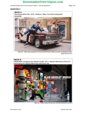
2.1 2.1.1 1 Mark will be awarded for a correct stereotype identified by the
candidate.
• The man dressed in the blue suit with the pose which could be a
stereotype for a metro man.
• The police officer eating doughnuts is a stereotype for what
American police officers are known for spending their time doing.
• The use of pink in the doughnut shop is a feminine colour
associated with women baking goods.
2.1.2 1 Mark will be awarded for a correct link between the stereotype
and the message Serviceplan wants to communicate.
• Metro man stereotype: wearing the Strellson suit gives the man
the self-assurance and determination to dress and act like a
metro man (daring, dynamic in the sense that he dares to sit on
the officer's car and helps himself to doughnuts).
• The police officer is a stereotype of conservative thinking which
could counter the actions and self-assurance of the man wearing
the Strellson suit (looking away while he is being robbed).
• The colour pink although a stereotypical feminine colour,
communicates that men can embrace a more feminine look and
attitude – blurring gender lines.
• Any credible answer which links stereotype to communication.
2.1.3 1 Mark is awarded for correctly identified symbolic language used in
the design. This may include any of the following:
• Personal identity: consider how we express ourselves through
aspects of our physicality and culture.
• Allegory: allegory is a form of extended metaphor, in which
objects, persons, and actions in a narrative, are equated with the
meanings that lie outside the narrative itself.
• Parody: is a humorous or satirical imitation.
• Irony: involves a twist of language, often by using the opposite of
what is meant.
IEB Copyright © 2018 PLEASE TURN OVER
Downloaded from hlayiso.com
NATIONAL SENIOR CERTIFICATE: DESIGN: PAPER I – MARKING GUIDELINES Page 5 of 23
2.1.4 2 marks will be awarded for the correct explanation of how the
symbolic language is used in the campaign.
• 1 mark for the correct application of the message to the identified
as symbolic language.
• 1 mark for the message communicated.
• Personal identity is used when we consider the personal identity
men create for themselves when wearing Strellson suits. They
create an identity that blur the lines between genders.
• Allegory: the action where the man in the Strellson suit
confidently helps himself to a doughnut from a "real" man's box of
doughnuts is an allegory for questioning what a real man is in
today's society.
• Parody was used in that the metro man has the confidence to
help himself to a doughnut from the police officers box of
doughnuts. The designers created a narrative in a humorous
manner to communicate the self-confidence and unwavering
determination of the man in the foreground.
• Irony is used in the juxtaposition of the manly man (police officer)
against the more feminine man (metro man). It is ironic as people
would see police officers as more confident and determined than
a man who is in touch with his feminine side.
2.2 2.2.1 2 marks will be awarded for this answer.
1 mark is awarded for the correct identification of Sans serif font/
Helvetica/Uppercase/Arial.
1 mark will be awarded for the explanation.
• Mostly used in headings due to the simplicity of the letter shapes
and because of their recognisability.
• Better at small sizes because the fonts survive reproduction and
smearing because of their simple forms.
• Typically used for emphasis in headings and on billboards as it is
easily recognisable and readable.
• When expanded, the characters retain the general shapes.
2.2.2 1 mark is awarded for identifying the correct visual metaphor used in
the advertisement.
• The lips in the form of amplifiers is a metaphor. (Choir)
• Metaphor is the use of an image for something it does not
literally denote (literary/visual).
1 mark is awarded for the correct explanation for the visual metaphor
in the advertisement.
• The lips in the form of amplifiers is a metaphor for the
amplification of creativity through the digital experience created
through the interactive site. This is a successful metaphor as it
represents a concept which it is not literally.
IEB Copyright © 2018 PLEASE TURN OVER
Downloaded from hlayiso.com
NATIONAL SENIOR CERTIFICATE: DESIGN: PAPER I – MARKING GUIDELINES Page 6 of 23
QUESTION 3 VISUAL ANALYSIS
Analysis of Cognitive Skills
Question 3
HIGHER:
LOWER: MIDDLE:
Analysis,
Knowledge, Comprehension, MARKS LEVEL of difficulty
Synthesis,
Recall Application
Evaluation
3.1 3 3 Difficult
3.2 1 1 Very difficult
0 4 4
0% 50% 50%
3.1
Design Elements: Identify and analyse TWO Design
Principles.
IMAGE C
Line: The gentle, shallow 3.1.1 Bilateral symmetry is created
curves created by the spiral through the spiral which is
lines of the walking ramp on equally arranged on either side
the interior of the building of the central axis of the
seem suspended within the structure. This is created
geometric linear framework of through the soft, shallow curve
the exterior. of the spiral.
Rhythm is created through a
variety of lines in the structure,
e.g. the repetition of the spiral
lines create linear rhythm.
Form: The hemispherical 3.1.2 The scale of the structure
structure is made up of dwarfs the human viewer. It
geometric forms. The building communicates power and
is 3 dimensional in nature invincibility through proportion.
and a man-made inorganic
structure that is abstract in Unity is created through the
nature. consistency of form
throughout the structure.
Texture: The appearance of 3.1.3 Unity is created through the
the glass panels on the consistency of texture
outside of the structure throughout the structure.
communicates the smooth
texture of the structure.
Other options may also be considered.
1 mark is awarded for the correct identification of an appropriate principle.
1 mark is awarded for the discussion of the function of chosen principle.
Principles may include, but not repeated in more than one answer:
• unity • balance
• contrast • gradation
• emphasis/dominance • proportion/scale
• variety • directional forces
• repetition/rhythm • simplicity
• harmony
IEB Copyright © 2018 PLEASE TURN OVER
Downloaded from hlayiso.com
NATIONAL SENIOR CERTIFICATE: DESIGN: PAPER I – MARKING GUIDELINES Page 7 of 23
3.2 1 mark is awarded for the correct naming of a gestalt principle.
1 mark is awarded for the correct explanation of the principle in the design.
• Closure: occurs when an object is incomplete or a space is not
completely enclosed. The two fingers that connect around the eye
create closure in order for the viewer to be able to know that there is a
face behind the hand.
• Figure-ground: the eye differentiates an object from its surrounding
area. The shape of the hand is perceived as figure while the eye is
perceived as ground.
• Proximity: occurs when elements are placed close together. They tend
to be perceived as a group. The different shapes that are placed
together form the shape of a hand due to the close proximity of the
shapes.
• Contiguity/Continuation: occurs when the eye is compelled to move
through one object and continue to another object. The viewer's eye is
led from the eye to the fingers which extend to the logo for LifeWtr.
• Uniform connectedness/Similarity: the different sections of the hand
is read as uniform through the contrast in patterning. These shapes are
read as one and forms the shape of the hand and fingers around the
eye.
• Any other relevant gestalt principle and explanation will be accepted if
explained appropriately.
IEB Copyright © 2018 PLEASE TURN OVER
Downloaded from hlayiso.com
NATIONAL SENIOR CERTIFICATE: DESIGN: PAPER I – MARKING GUIDELINES Page 8 of 23
QUESTION 4 TERMINOLOGY
Analysis of Cognitive Skills
Question 4
HIGHER:
LOWER: MIDDLE:
Analysis, LEVEL of
Knowledge, Comprehension, MARKS
Synthesis, difficulty
Recall Application
Evaluation
4.1 2 Average
4.2 1 Easy
4.3 1 Average
4.4 1 Easy
4.5 1 Average
4.6 1 Easy
4.7 1 Easy
6 2 0
75% 25% 0%
4.1 1 mark will be awarded for each correct definition and substantiation with
Adidas.
• Guerrilla marketing is a low-cost advertising strategy using innovative
and unconventional ways of promoting a brand, idea or product, for
example sticker bombing, flash mobs or graffiti.
• Experience economy is an economy in which many goods or services
are sold by emphasising the effect they can have on people's lives. This
can be done through the Parley shoe that shows the positive
environmental effect which would benefit consumers and the
generations to come.
Extensions to the answer:
• IMAGE H is an example of Guerrilla marketing. Shopping in an
Adidas show box which are scaled up into a popup shop would leave a
lasting impression on the consumer which they will talk about with others
and also therefore indirectly advertise the brand further.
• IMAGE I is an example of Guerrilla marketing. Boost is another
initiative allowing customers to view and test the latest products
revolving around Boost technology. This is done in public where anyone
can test the technology in open view of all, advertising the brand.
4.2 1 mark will be awarded for a correct definition.
• Mass customisation is the customising of mass produced goods to
allow for individualisation and involvement of everyone in niche markets.
4.3 1 mark is awarded to making the link between the definition for mass
customisation and the Adidas brand.
• IMAGE G is an example of mass customisation. Their miAdidas
range is a favourite among consumers allowing them to design their own
shoes and apparel in the online store.
4.4 1 mark is awarded for the correct definition.
• Collaborative design recruits a wider range of contributions to the
design process. In an academic context, this may involve collaboration
with researchers from a range of academic disciplines, who are
regarded as members of the research team, and also collaboration with
external collaborators.
IEB Copyright © 2018 PLEASE TURN OVER
Downloaded from hlayiso.com
NATIONAL SENIOR CERTIFICATE: DESIGN: PAPER I – MARKING GUIDELINES Page 9 of 23
4.5 1 mark is awarded for explaining the concept of responsible design correctly
through linking it to the Parley shoe.
• Design business which takes into consideration: design for the real
world, eco-design, inclusive design, design for all, design for disability,
and more recently, eco-efficient innovation and design against crime.
The integration of social and environmental policies into day-to-day
corporate business and the involvement of internal and external
stakeholders to deliver these policies. CSR is a form of corporate self-
regulation integrated into a business model. Ethical standards of a
business to allow sustainability.
• IMAGE F is an example of responsible design. Adidas believes in a
responsible approach to design collaborating with Parley to prevent
plastic entering the ocean by creating high performance sportswear from
recycled plastic.
4.6 1 mark will be awarded for a correct definition.
• A Brand Ambassador is a person who is hired by an organisation or
company to represent a brand in a positive light and by doing so, help to
increase brand awareness and sales.
4.7 1 mark is awarded for making the link between the definition of a brand
ambassador and Kanye West.
• IMAGE E is an example of how Adidas uses brand ambassadors in
their advertising. Kanye West is used to show that Adidas is not only a
sport label, but rather a high end brand who caters for a variety of users.
West's followers would want to wear the same brand as him and
therefore is used as an advertising tool.
IEB Copyright © 2018 PLEASE TURN OVER
Downloaded from hlayiso.com
NATIONAL SENIOR CERTIFICATE: DESIGN: PAPER I – MARKING GUIDELINES Page 10 of 23
SECTION B DESIGN IN CONTEXT – HISTORICAL
QUESTION 5
Analysis of Cognitive Skills
Question 5
HIGHER:
LOWER: MIDDLE:
Analysis, LEVEL of
Knowledge, Comprehension, MARKS
Synthesis, difficulty
Recall Application
Evaluation
5 Structure 2 Average
5 Context 4 3 Difficult
5 Facts 3 6 Average
5 Analysis 9 Difficult
5 Terminology 3 Easy
6 12 12
20% 40% 40%
The essay will be assessed according to the following rubric:
SECTION B
Question 5: Design in a Historical Context
Logical flow of introduction, body, conclusion
Structure
Introduction/Conclusion Length
(S) 2
0 1 0 1
Appropriate contextual relevance to the answer.
7 marks max:
Contextual Characteristics of movement
Thematic Context related to the question
Context
(C) Anti-Design, Hi-Tech, Memphis, Postmodernism, Deconstruction
Movement (1) Movement (2) Movement (3) 7
0 1 0 1 0 1
2 3/max 2 3/max 2 3/max
Names of Designer's and Designs:
Content/ • 3 marks max: name of the Designers (correctly spelt)
Facts • 6 marks max: 2 names of works/designs (correctly spelt and
(F) underlined)
Movement (1) Movement (2) Movement (3)
Designer 0 1 0 1 0 1 9
Designs 1 2 1 2 1 2
Detailed discussion of strategic works with regards to influences and
characteristics applied to design examples.
Specific visual literacy observations and application of characteristics
of the movement/statement/context to designs
Analysis 3 marks max per design: at least one work discussed in detail per
(V) designer (2 designs per designer)
9 marks max
Movement (1) Movement (2) Movement (3)
0 1 0 1 0 1 9
2 3 2 3 2 3
Relevant use and level of "design-speak" – superior terms underlined with
Terminology
bracketed definition
(T)
1 2 3 3
TOTAL 30
IEB Copyright © 2018 PLEASE TURN OVER
Downloaded from hlayiso.com
NATIONAL SENIOR CERTIFICATE: DESIGN: PAPER I – MARKING GUIDELINES Page 11 of 23
Theme: Rise of Cultural identity
• The marker should read through the essay, ticking relevant facts/terms/points.
• Markers should be very clear in their marking of the essays and should place their ticks
DIRECTLY ABOVE/ON the fact/term/concept being awarded the mark and NOT in the
margin. In this way, moderation can be accurate.
• Thereafter, each tick given must be categorised by writing: S for structure, C for
context, F for facts, A for analysis and T for terminology next to the relevant tick. Use
the detailed explanation that follows.
• The totals for S, C, F, A and T should be clearly noted at the end of the essay.
• It is possible that an essay has ONLY facts, but no context. This will result in a number
of F ticks that amount to more than the maximum of 9 marks. This should be shown in
the question total at the end of the essay as follows: If a candidate gets 13 ticks for
facts, write 13–4 (9).
Marks awarded in this compulsory essay are indicated and allocated according to
the following grid as outlined in the examination paper. Follow the detailed marking
guideline that follows:
S = STRUCTURE:
• Introduction and Conclusion (Response) –
ONE STRUCTURE MARK to be awarded for an appropriate introduction, appropriate
and relevant conclusion, clearly responding to/addressing the issues being asked in
the question. Students cannot merely write a rehearsed essay on a movement. If the
introduction does NOT CLEARLY address the specific question, no mark is to be
awarded.
• Length – 1 mark
ONE STRUCTURE MARK for an adequate length essay, of at least 250 words/
3 pages. The argument/discourse should flow logically and should be written in full,
logical sentences with no point-form listing of facts which end in a conclusion.
If the essay is under a page, no mark to be awarded.
C = CONTEXT:
Maximum of 7 marks to be awarded.
• ONE CONTEXT/ARGUMENT MARK should be awarded for each relevant
contextual factor informed by the specific question.
• Contextual Characteristics: These factors can relate to the relevant political, social,
cultural, economic and environmental circumstances that impacted on the designed
products.
• Thematic Characteristics: These factors can relate to the relevant theme as indicated
in the question that is communicated through the designed products.
Reference to the biographical details of designers is mostly irrelevant.
Any extraneous contextual factors outside the reference of the question should be
ignored.
IEB Copyright © 2018 PLEASE TURN OVER
Downloaded from hlayiso.com
NATIONAL SENIOR CERTIFICATE: DESIGN: PAPER I – MARKING GUIDELINES Page 12 of 23
F = FACTUAL:
Maximum of 9 marks to be awarded.
• ONE FACTUAL MARK should be awarded for each relevant and correctly spelt
designer (the first time the designer's name is mentioned, not subsequent naming).
• ONE FACTUAL MARK for each relevant and correctly spelt design work that is an
appropriate example to substantiate the answer.
• Marks should be awarded for a maximum of 3 designers/2 works each to avoid
listing.
• If other works are discussed in detail, marks should be awarded under Analysis for
the discussion, but not for the name of the work (lower order skill). (At least
3 designers/2 works each as stated in the question)
A = ANALYSIS:
Maximum of 9 marks to be awarded.
• ONE ANALYSIS MARK should be awarded for each relevant and correct
description and analysis of a design work using the elements and principles or
application of relevant characteristics of movements.
• Specific visual literacy observations and application of characteristics of the
movement/statement/context to designs.
• 3 marks max per design: At least ONE work discussed in detail per designer (2
designs per designer).
No marks should be awarded for invalidated value judgements.
* The purpose of analysis is to support the argument/discussion. Goes beyond providing
a mere analysis of elements and principles to looking at how it shapes our
understanding of the designs answering the question.
T = TERMINOLOGY:
Maximum of 3 marks to be awarded.
• ONE TERMINOLOGY MARK should be awarded for each relevant and correct
term used/relevant use and level of "design-speak".
• The use of correct design terms, language and references will be an indicator of the
quality of the answers.
• The meaning of the term may be indicated in brackets as a "footnote" to the
discussion.
• Preferably located outside of the Visual Analysis of designs unless this is
unavoidable.
Introduction:
Agree:
With the rise of a cultural identity, designers need to consider how difficult it is to stay true
to one's identity due to the technological advancements from the 1980s. The world is no
longer isolated and therefore different cultures influence each other constantly. This has
given rise to a global identity that could specifically be linked to popular culture. It is very
important for designers to constantly think of the user and reflect during their process and
implementation of new methods on how current practices can advance the boundaries of
our understanding of community. Through questioning your cultural identity you will be
able to develop a global identity through improvements of all aspects of cultural identity.
IEB Copyright © 2018 PLEASE TURN OVER
Downloaded from hlayiso.com
NATIONAL SENIOR CERTIFICATE: DESIGN: PAPER I – MARKING GUIDELINES Page 13 of 23
Disagree:
With the rise of a cultural identity vernacular plays a vital role. Vernacular in design refers
to that type of design which is indigenous to a specific time or place. Designers will make
use of a Youser-centred approach to relook the designs and styles from the past and try
and improve on them through various design solutions. However, they will not change
their identity and implement new methods to allow current practices to advance
boundaries of community to such an extent as they would like to conserve their culture.
Building of argument may include some of the following points:
Context
• 1973 energy crisis encouraged the search for alternatives and ecological alternatives.
• Digital breakthroughs: Applemac 1984, Internet 1989, World Wide Web 1991
advanced the boundaries of our understanding of community – rise of a global identity.
• New production methods, e.g. 3D printing.
• Berlin wall comes down ... 1990 reunification of Germany – the USSR disbands.
• Gulf Wars; September 11th 2001, War on Terrorism: Afghanistan, 2003 Iraq; Rwandan
genocide.
Anti-design
• Anti-design was also called "contro-design" (counter-design) or radical design, in
1960s Italy.
• Economies had reached the limits of growth, or, of the fast-paced growth to which they
had become accustomed.
• And then with the early 1970s came the oil crises of 1973. The crises, brought on by an
OPEC decision to raise oil prices dramatically, meant oil shortages, inflation, and other
problems for the oil-importing nation. OPEC's decision also brought on a general sense
of economic and ecological vulnerability that filtered down into most walks of life.
• It was also a time of extraordinary technological advances when the Soviet
cosmonaut Yuri Gagarin became the first man in space and the first weather satellite
was launched from Cape Canaveral.
• Anti-Design movement embraced:
− radical student politics in these years
− the whimsical nature of Pop,
− humour and irony of the American Pop artists
− looked back to the tactics of the surrealists to create an art of provocation,
consumerism and mass-media.
− Delighted in colourful, gaudy paints and fabric, for example, the use of plastic
laminate.
− And an ironic, kitschy spirit. Kitsch is the tacky low-art artefacts of everyday life
such as Eiffel Tower lamps, black velvet paintings of Elvis, lurid images on romance
novels.
− The renewal of the cultural and political role of design.
Hi-Tech
• Hi-Tech is a style that since the late 1970s and 1980s, elevated technology to an
aesthetic principle in architecture and design;
• the style is characterised by visible structural elements such as pipes, cables, and
supports, and by materials such as steel, sheet metal and glass, even in the home.
• With increased space exploration, the scientific and technological advances had a big
impact on societies in the 1970s. The Space Race climaxed in 1969 with Neil
Armstrong's landing on the moon, and came along with excessive military
IEB Copyright © 2018 PLEASE TURN OVER
Downloaded from hlayiso.com
NATIONAL SENIOR CERTIFICATE: DESIGN: PAPER I – MARKING GUIDELINES Page 14 of 23
developments. These advances set people's minds thinking that much more can be
achieved with advancing technology.
• Rational design played itself out in appliances and hi-tech home accessories for a
minimalist highly functional aesthetic. This gave rise to the idea of the "matt black
dream home", and the Minimalist look.
Rationalist Design – The Technotronic Revolution
• In the decades after WW2, the tide of industrialisation peaked, bringing in the
Technotronic Revolution. Technology became the commander of the economy and the
muscle technologies of the industrial revolution were replaced by computer-based
technologies.
• Technological advances in the production of goods transformed everything, resulting in
industries based on computers, electronics, information technology and biotechnology.
• Robots proliferate, assembly lines are automated, with speedy control and accuracy
freeing humankind up for new activities other than muscle-based work.
• The design of electronic goods and other technological products grows into a large
industry.
• Miniaturisation skills learned and transmitted by Japan's master craftsmen were now
being vigorously applied in the design of increasingly smaller, lightweight, high-tech
products for consumers who want more functions, less bulk, and a high return on a
diminutive but empowered item.
• This gave rise to the growth of the large electronic companies in Germany: Braun,
AEG/Japan: SONY/America: GEC.
Use of Material
• High-tech architecture and design aimed to give everything an industrial
appearance, with the use of industrial materials and of minimalist, linear forms,
creating residences and public buildings with a "nuts-and-bolts, exposed-pipes,
technological look".
• High-tech design involves the use of the materials associated with high-tech
industries, such as space frames, stainless steel, metal cladding and composite
fabrics and materials. Glass walls and steel frames were also immensely popular.
• Technological instruments also became a common sight for people at the time
because of the use of ramps, video screens, headphones, and bare scaffolds.
• High tech buildings often have extensive glazing to show to the outside world the
activity going on inside.
Characteristics
• The principle of high-tech architecture relies on nothing more than a combination
of machined parts that are maximally flexible and, ideally, interchangeable.
• Characteristics of high-tech architecture have varied somewhat, yet all have
accentuated technical elements. They included the prominent display of the
building's technical and functional components, and an orderly arrangement and
use of pre-fabricated elements. To boast technical features, they were
externalised, often along with load-bearing structures.
• The high-tech design style combines the use of factory-produced materials and a
tendency to expose a building's structural systems.
• Generally their overall appearance is light, typically with a combination of dramatic
curves and straight lines.
Memphis:
• New style.
• The shock factor grabbed attention because of low brow "subject matter".
IEB Copyright © 2018 PLEASE TURN OVER
Downloaded from hlayiso.com
NATIONAL SENIOR CERTIFICATE: DESIGN: PAPER I – MARKING GUIDELINES Page 15 of 23
• The use of kitsch.
• The combination of different materials – cheap and expensive.
• The function of works is not as significant as its appearance.
• Over-emphasis on decoration makes it difficult to ignore designs.
• References to past and other figurative designs (Mendini's Proust Chair).
• The individual expression and work becomes prized and sought after: each Memphis
designer draws on legacy of previous designs and makes them their own.
− This is one manner in which designers employed a youser-centered approach.
− This was not always to better designs or circumstances, but more for aesthetic
purposes.
• Works are not mass-produced but have the potential to be reproduced in various
forms.
• Emotional response required for these designs.
• Multi-disciplinary designers: their reach into NEW DESIGN forms and expressions.
• The Memphis group preferred to place its focus on the sensual relationship between
object and user and wanted to extend their work further than manifestos, ideal
communities and individually challenging pieces as a radical antidote to
functionalism.
• Their solution was to continue the experiments with unconventional materials,
historic forms, kitsch motifs and gaudy colours begun by Studio Alchymia =
Zeitgeist.
• From this point, plastic was no longer glamorised as "modern" and "high-tech", it was
spurned as "cheap", tacky, taste-less and with the growing environmental awareness,
un-ecological.
• By glorying in the cheesiness of consumer culture, Memphis was "quoting from
suburbia," as Sottsass put it. "Memphis is not new, Memphis is everywhere".
• For Memphis, ordinary daily things were the particular characteristics of contemporary
life. Thus, they transplanted plastic laminates (melamine, Formica) from the bars and
cafes of the 1950s and 1960s into private residence.
• The practical purpose of the objects was of no concern. This highlights the theme of
design and lifestyle as aesthetics played a bigger role than functionality.
• This highlights the theme of eclecticism and pluralism as Memphis members
incorporated exotic cultures into their designs and incorporated the disconnectedness
of postmodernity.
POMO:
• POMO continues to reference the past and inject humour and irony into design as
Memphis had done: Charles Moore's Piazza d'Italia combines a visual encyclopaedia
of Italian architectural features and combines it with neon lighting.
• Return to craftsmanship and pluralism: Venturi's chairs. Designers are not rethinking
previous designs but incorporate vernacular as to pay homage to certain cultures.
• There is a combination of different design styles therefore adding to a new globally
acceptable identity.
• Postmodernist aim of communicating a meaning and the characteristic of symbolism.
Double coding means the buildings convey many meanings simultaneously.
• Pluralism of style and influence, along with liberation from the suffocating philosophy
of functionalism, now determined the course of design throughout Europe. In the
process, the importance and stature of design itself also grew. The 1980s became a
decade of design.
IEB Copyright © 2018 PLEASE TURN OVER
Downloaded from hlayiso.com
NATIONAL SENIOR CERTIFICATE: DESIGN: PAPER I – MARKING GUIDELINES Page 16 of 23
• Design took over a key role not only in marketing and advertising, but also in the
outfitting of the individual life-style, in patterns of consumption and social modes of
behaviour.
• There are a number of characteristics that postmodern design comprise, including
colourful and sign-like shaping of surfaces (which by now had become totally
independent of function), the reinterpretation of an object's appearance in relation
to its use, and as in postmodern architecture, the quotation and combination of
historical elements.
• At the same time, taking a stand that went directly against the grain of functionalistic
doctrine, postmodern designers combined rich ornamentation with minimalist
forms, expensive materials with kitsch. Formally, postmodernism in the 1970s and
1980s was above all a blow for freedom from the dictates of the modern; structurally,
the new movement was influenced by the rapid incursion of microelectronics into every
area of life, and the resulting restructuring of industry and society.
Deconstructivism:
• Principles and spirit behind Deconstructivism: Derrida's multiple interpretations.
Opposing the rationality of modernism. Designs are unique and stand apart from
surrounding designs.
• Kitsch factor. E.g. Libeskind's Jewish Museum makes use of broken and jagged forms
as lines cut into concrete and metal of the building; rejection of historicism and
ornamentation in the stark materials exposed; spaces like the rooftop reveal the multi-
layering as parallel lines appear and disappear reminiscent of the rail tracks leading
into death camps; the twisted geometries of the space provide illusions of where one
is moving to while preventing movement into other spaces.
• The designer aims to challenge the experience of the visitor and expose viewers to the
experience of the holocaust; multiple interpretations are possible in various spaces; the
warped and overlapped planes, 'disturbing' shapes, centreless planes, and shards of
glass and metal bring visitors into the experience and create frustration at not finding
neat clean endings and beginnings. Spaces are disjointed and abrupt; lines of
buildings are disjointed and cut, emphasising the lack of unity and harmony/
incompletion and subjectivity. Decomposition (analysing, randomness, automatism)/
Decentering (inclined planes and slanted lines, i.e. not horizontal/vertical).
Discontinuity of spaces and lines (mixture, overlayed, distortion and accident).
Purposeful disjunction (separation and fission/limitation and interruption) mimics the
experiences in concentration camps/to life.
• With the increasing success of social media and popular culture being pushed on
many fronts, design has become part of our lives on many fronts.
• Products are not designed to only fulfil a functional role but aesthetics plays a vital part
these days. The design styling is what distinguishes different classes and design has
become the key to the hierarchy of lifestyle.
• Deconstructivism is based on the premises that much of human history, in trying to
understand, and then define, reality has led to various forms of domination (power) – of
nature, of people of colour, of the poor, of homosexuals etc.
• Like postmodernism finds concrete experience more valid than abstract ideas and,
therefore, refutes (prove) any attempts to produce a history, or a truth. In other words,
the multiplicities and contingencies of human experience necessarily bring knowledge
down to the local and specific level, and challenge the tendency to centralise power
through the claims of an ultimate truth which must be accepted or obeyed by all.
IEB Copyright © 2018 PLEASE TURN OVER
Downloaded from hlayiso.com
NATIONAL SENIOR CERTIFICATE: DESIGN: PAPER I – MARKING GUIDELINES Page 17 of 23
Facts:
THEMES MOVEMENTS DESIGNERS
Archizoom
Superstudio
UFO
Gruppo Strum
Anti-Design 9999
Global Tools
Studio 65
Studio alchymia
Vivienne Westwood & Punk
Chadwick & Stumpf
James Dyson
Richard Rodgers
Hi-Tech Dieter Rams
Renzo Piano
Norman Foster
Richard Sapper
Rise of Ettore Sottsass
Cultural Martine Bedin
Identity Memphis Michelle de Luchi
George Sowden
Natalie du Pasquier
April Greiman Neville Brody
Tibor Kalman Charles Moore
Charles Jenks Michael Graves
Phillip Johnson Robert Venturi
POMO
Stefano Giovanoni Philippe Starck
Jonathan Ive Tom Dixon
Ron Arad Ross Lovegrove
Alexander McQueen Marc Newson
Deconstructivism Frank Gehry
Bernard Tschumi
Daniel Libeskind
David Carson
Rem Koolhaas
Santiago Calatrava
Zaha Hadid
*OTHER RELEVANT DESIGNERS WILL BE ACCEPTED.
IEB Copyright © 2018 PLEASE TURN OVER
Downloaded from hlayiso.com
NATIONAL SENIOR CERTIFICATE: DESIGN: PAPER I – MARKING GUIDELINES Page 18 of 23
SECTION C DESIGN IN CONTEXT – CONTEMPORARY
Answer TWO questions from this section.
Do not repeat the same information in different answers.
Underline the names of designers and titles of designs.
Format all answers in paragraph format.
Rubric applicable to Question 6.4, 7.4 and 8.4
Definition Local International Total
N 4.1. Name of designers - 1 1 2
F 4.2. Titles and brief description of works - 1 1 2
V 4.3. Discussion of work/analysis of design - 4
1 2 1 2
R 4.4. Definition/relevant argument 1 4
max max
It is important to refer to the Paper III CAT Marking Guidelines when marking this section as
learners are allowed to make use of any of the relevant designers as long as they are not repeated
in more than one answer. The designers and designs in the marking guidelines are from the CAT
task and any of them can be used if relevant to the question. See next page.
Local Designers International Designers
Communication Design
• Bittersuite Sea Change for John McCarthy; • Leo Burnett Nature's Eyes; Just; Poachers
Wazoogles – World's 1st WI-FI Unicorn; Bittersuite – Campaign.
Corporate Identity; Like Giants – The Greener Surfer. • Grey Ryman Eco; #Join the Herd; Swedish Air.
• The Hardy Boys Sunlight Saves Water; OMO tells • Wieden + Kennedy Girl Effect; Dress Normal –
Moms to let kids explore; Edamame. Play your Stripes; Ballet Font; On she goes; Airport
• Joe Public HIV Army or State of the Nation (Brothers Code; the Skin issue.
for Life); Project English or project Space (One • David Butler (Coca-Cola) Ramadan Cans;
School at a Time); Fonts for the Future. interactive vending machine; bottle caps for calls.
• Jupiter Drawing Room Personology; Children of • Fabrica (United Colours of Benetton) Be part of
Fire; Teaching Typefaces; Pure beer society; Baking the Solution; HIV campaigns; UnHate; Food for
together. Stability; Dynamic Airfields/Fuha; Outline; Water
Culture.
• Sagmeister & Walsh Meetup; Barneys Book;
40 days of dating; BMW book.
Product Design
• ... XYZ Freeplay radio; socket; benchArt; GEO • Layer (Benjamin Hubert) Worldbeing, Scale, Axyl,
modular display; Rapid routes; I-aware. GO wheelchair.
• Black Coffee Everyonecanbeadesigner; Influenced • Iris van Herpen Synesthesia; Biopiracy;
Style; Fusion. Quaquaversal; Wilderness Embodied.
• Maxhosa by Laduma Apropriyyeyshin; • Fuseproject (Yves Behar) OLPC; See Well to
Mntanom'Gquba; "Buyele'Mbo"; Amakrwala; "My Learn Better; SNOO, Jawbone, Y-water; Deep blue
Heritage, My Inheritance" collections bag.
• David Krynauw Jeppestown Playbench, Jeppestown • Hella Jongerius Shippo plates; Beads ‘n Pieces;
bench, Haywire. Taking a stance; Four seasons: Walk Inside.
Environmental design and architecture
• Touching the Earth Lightly Greenshack; Fireproof • Vincent Callebaut Tao Zhu Yin Yuan; The Gate
shack; Ayob's Lighthouse. Residence; Lilypad.
• Tsai Design Studio Safmarine-Vissershoek School; • Stefano Boeri Vertical Forest; Urban Hugs;
Nested bunk beds; pony chair; Zip-Zap circus. Chongqinq Hortitecture.
• Peter Rich (Light Earth Design) Alexandria Heritage • Alejandro Aravena (Elemental). Quinta Monroy;
Centre; Makuleke Cultural Project; Gahini Church; UC Innovation Centre; Siamese Towers; Children's
House Kennedy. Bicentennial Park.
• Andy Horn (EcoDesign) 7 fountains primary school; • Diebedo Francis Kere Lycee Schorge; Gando;
Nieuwoudtville Caravan Site. Opera Village.
• Bjarke Ingels (BIG) The museum of the human
body; Urban Future; Hyperloop One; Amager
Bakke; Google North Bayshore.
IEB Copyright © 2018 PLEASE TURN OVER
Downloaded from hlayiso.com
NATIONAL SENIOR CERTIFICATE: DESIGN: PAPER I – MARKING GUIDELINES Page 19 of 23
Surface Design
• Design Team Protea collection; Modern Botanic; My • MIO (Jaime Salm) V2 PaperForms; Nomad
Succulent Garden. System; Bendant Lamp.
• Lovell Friedman Rock Girl Playground for the blind; • Tord Boontje Transglass; Little Flowers falling;
Mitchell's Plain Hospital: "Healing the world, healing Elements; Almond Blossom.
the environment"; Rock Girl bench • Bourroullec Brothers Kioske (modular pavilions);
• Fabric Nation Toile du Jozi; Old postcards; Cape Cloud; Sowing rug for Danskina.
Town Weave.
Multi-disciplinary design
• Daniel Ting-Chong Okayafrica; Puma Duplex • Hdesign (Gregory Hoogstoel) Kuskus chair;
Sneaker Collab; Braamfie Runners; Unknown Union. Komako/Atua; Altao; Plastiketic campaign.
• Dokter & Misses Flex desk; Isabelo smart bench; • Studio Banana: Truth well built- McCann
Foreva XXX; Soldier Screen; Kassena server. worldgroup; Batband; Ostrichpillow; Be goods;
• Monkeybiz (Haas Sisters)/Haas brothers and Kangaroo light.
Bronze Age foundry (R & Company) Afreaks • IDEO Student-centered café, Willow All-in-One
(Mushrooms, creatures, couch); beaded works. breast pump; Melon headband; Sealy/Tempur;
Future kitchen; Smarter mobility; LEED dynamic
plaque.
QUESTION 6 DESIGN IN AN ENVIRONMENTAL CONTEXT
6.1 1 mark will be awarded for a correct definition of hedonistic sustainability.
1 mark will be awarded for a correctly spelt designer and design used as
substantiation.
It is important that the explanation includes that sustainability becomes
enjoyable for the youser through hedonistic sustainability.
Sustainability that improves the quality of life and human
Hedonistic
enjoyment, hedonistic sustainability is touted as the "latest and
sustainability most exciting evolution in the green movement". It challenges this
misconception that sustainability means sacrifice.
6.2 1 mark will be awarded for each correct definition. (2)
1 mark will be awarded for a correctly spelt relevant designer and design. (1)
The doctrine that mutual dependence is necessary to social well-
Mutualism
being.
Responsive design is the approach that suggests that design and
Responsive
development should respond to the user's behaviour and
design
environment.
6.3 1 mark will be awarded for each correct definition. (2)
1 mark will be awarded for a correctly spelt relevant designer and design. (1)
Product (PLC) is the cycle through which every product goes through from
Life-cycle introduction to withdrawal or eventual demise.
Design for Longevity (D4L) is having a longer usable life for a product/
service, which in effect causes products to be replaced less frequently
D4L
– reducing the volume discarded and meaning fewer resources are
consumed in manufacturing.
IEB Copyright © 2018 PLEASE TURN OVER
Downloaded from hlayiso.com
NATIONAL SENIOR CERTIFICATE: DESIGN: PAPER I – MARKING GUIDELINES Page 20 of 23
6.4 6.4.1 1 mark will be awarded for each relevant designer (ONE Local and
ONE international and cannot be repeated again in the paper.
6.4.2 One mark will be awarded for EACH correctly spelt relevant design
AND description. Max 2 designs.
6.4.3 1 mark will be awarded for each relevant analysis point. Max 4
marks.
6.4.4 1 mark will be awarded for the correct definition.
3 marks max will be awarded for explaining the concept. These
marks can only be awarded if it is explained in connection with the
selected designs. 2 marks max for the first design.
Biophilic Biophilic design is about making and strengthening a connection
design with many aspects of nature. It is about natural light, views on
nature, plants, natural materials, textures and patterns.
AND/OR
IEB Copyright © 2018 PLEASE TURN OVER
Downloaded from hlayiso.com
NATIONAL SENIOR CERTIFICATE: DESIGN: PAPER I – MARKING GUIDELINES Page 21 of 23
QUESTION 7 DESIGN IN A SOCIAL CONTEXT
7.1 1 mark will be awarded for the correct definition of wayfinding.
1 mark will be awarded for the discussion of a relevant design example.
Wayfinding refers to information systems that guide people through a
physical environment and enhance their understanding and experience
Wayfinding of the space. Wayfinding is particularly important in complex built
environments such as urban centres, healthcare and educational
campuses, and transportation facilities.
7.2 2 marks will be awarded for the correct definitions of social regeneration
and human-centred design.
1 mark will be awarded for the discussion of a relevant design example.
Human-centred design involves designing specifically with the
user experience in mind, enabling them to use a product that is
Human-centred guaranteed to function at a very high-level performance. The
design designer is governed by the needs and wants of the user and
consults intensive research in order to understand the target
market.
Social regeneration is concerted social, economic and physical
action to help people in neighbourhoods, experiencing multiple
deprivations, reverse decline and create sustainable
Social communities. Process of tackling the social problems that lead
Regeneration to deprivation, such as crime and drugs. The process is
different from physical regeneration, which tackles run-down
buildings and communal areas, and economic regeneration,
which is aimed at creating jobs and wealth.
7.3 2 marks will be awarded for the correct definitions.
1 mark will be awarded for the discussion of a relevant design example.
Design for
Design for extreme affordability is the design of products and
extreme
services that will change the lives of the world's poorest citizens.
affordability
Equitable access is about addressing social and economic
Equitable imbalances when designing, so that people from diverse
access backgrounds have more or less similar opportunities when it comes
to accessing the built environment and using products.
7.4 7.4.1 1 mark will be awarded for each relevant designer (ONE Local and
ONE international and cannot be repeated again in the paper.
7.4.2 One mark will be awarded for EACH correctly spelt design AND
description. Max 2 designs.
IEB Copyright © 2018 PLEASE TURN OVER
Downloaded from hlayiso.com
NATIONAL SENIOR CERTIFICATE: DESIGN: PAPER I – MARKING GUIDELINES Page 22 of 23
7.4.3 1 mark will be awarded for each analysis point. Max 4 marks.
7.4.4 1 mark will be awarded for the correct definition.
3 marks max will be awarded for explaining the concept. These
marks can only be awarded if it is explained in connection with the
selected designs. 2 marks max for the first design.
Every design decision has the potential to include or exclude
Access and customers. Inclusive design emphasises the contribution that
inclusivity understanding user diversity makes to informing these decisions, and
thus to including as many people as possible.
AND/OR
QUESTION 8 DESIGN IN A CULTURAL CONTEXT
8.1 1 mark will be awarded for the correct definition of cultural resonance.
1 mark will be awarded for the discussion of a relevant design example.
Cultural When the use of designs initiates conversation regarding the meaning
resonance and place of aspects of culture, cultural resonance is achieved.
8.2 1 mark will be awarded for each correct definition. (2)
1 mark will be awarded for the discussion of a relevant design example. (1)
Globalisation is the process of international integration arising from the
Globalisation interchange of world views, products, ideas, and other aspects of
culture.
The concept of cultural hybridity is closely related to other concepts
Cultural that are aimed to capture the mixture and interrelations between
Hybridity previously separate cultural units or to overcome what is perceived as
a problematic conception of clearly distinguishable cultural units.
IEB Copyright © 2018 PLEASE TURN OVER
Downloaded from hlayiso.com
NATIONAL SENIOR CERTIFICATE: DESIGN: PAPER I – MARKING GUIDELINES Page 23 of 23
8.3 1 mark will be awarded for the correct definition of empathic design and
homage. (2)
1 mark will be awarded for the discussion of a relevant design example.
Homage is a show or demonstration of respect or dedication to
Homage someone or something, sometimes by simple declaration but often by
some more oblique reference, artistic or poetic.
Empathetic Empathic design is a user-centered design approach that pays
design attention to the user's feelings toward a product. The empathic design
process is sometimes mistakenly referred to as empathetic design.
8.4 8.4.1 1 mark will be awarded for each relevant designer (ONE local and
ONE international and cannot be repeated again in the paper.
8.4.2 One mark will be awarded for EACH correctly spelt design AND
description. Max 2 designs.
8.4.3 1 mark will be awarded for each analysis point. Max 4 marks
8.4.4 1 mark will be awarded for the correct definition.
3 marks max will be awarded for explaining the concept in relevant
designs. These marks can only be awarded if it is explained in
connection with the selected designs. 2 marks max for the first
design.
Consumption Consumption culture is a form of capitalism in which the economy is
culture focused on the selling of consumer goods and the spending of
consumer money.
Total: 100 marks
IEB Copyright © 2018
Study this subject
Revise the topics in this paper, then practise them question by question.
- Grade 12 Design notes
CAPS revision notes with worked examples.
- Design questions by topic
Past exam questions sorted by CAPS topic, with memos where available.
- All Grade 12 Design past papers
Past papers by year, with memos where available.
- Grade 12 IEB past papers
More Design and other subjects in this collection.
Recommended for this subject
More papers and memos for this grade and subject.
MemorandumIEB
Design Grade 12 IEB Paper 1 2019 Memo
MemorandumIEB
Design Grade 12 IEB Paper 1 2017 Memo
AddendumIEB
Design Grade 12 IEB 2019 Addendum
Question paperIEB
Design Grade 12 IEB Paper 1 2019 Question Paper
Question paperIEB
Design Grade 12 IEB Paper 1 2018 Question Paper
AddendumIEB