
Downloaded from hlayiso.com
NATIONAL
SENIOR CERTIFICATE
GRADE 11
NOVEMBER 2015
DESIGN P1
MEMORANDUM
MARKS: 150
This memorandum consists of 22 pages.
Skip to contentMemorandum 

View all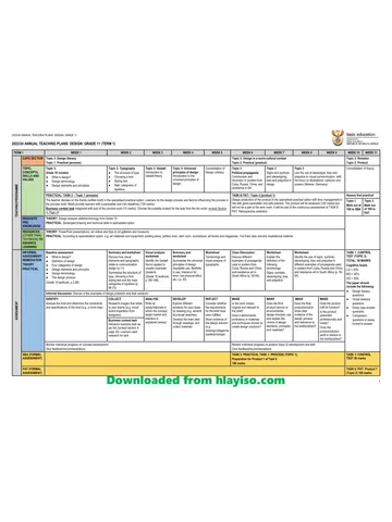
Design Grade 11 Paper 1 Eastern Cape November 2015 Memo
Grade 11 Design Paper 1 memorandum from the Eastern Cape November 2015, 22 pages. Read online or get the free PDF download, question paper linked when available.
Design · Grade 11 · Eastern Cape November · 2015. Memorandum, 22 pages. Read online or download the PDF.
- Subject
- Design
- Grade
- Grade 11
- Document type
- Memorandum
- Year
- 2015
- Exam period
- Eastern Cape November
- Paper
- 1
- Curriculum
- CAPS
- Pages
- 22
- File size
- 952.1 KB
Loading document…
Loading document…
1 of 22
Document textSearch extracted text and jump to a page.
Downloaded from hlayiso.com
2 DESIGN P1 (EC/NOVEMBER 2015)
SECTION A
QUESTION 1: VISUAL LITERACY – UNSEEN EXAMPLES
Design terminology: elements and principles of design including FIVE universal
principles of design.
Signs and symbols, stereotyping, bias and prejudice in design: link to visual
communication with the focus on illustrations, cartoons, posters, political
propaganda, communism, resistance (e.g. Weimar: Germany, Cuba, Russia,
China and South Africa)
History of typography: structure of type, choosing a font, styling of text, main
categories of typeface design, concise history of font.
1.1 1.1.1 (Allocate 10 marks)
Any of the following FIVE
LINE
The repetition of circular geometric line throughout the stool
creates unity.
Line moving in different directions creates movement. The
zigzag lines around the table top lead the eye horizontally around
the design and brings a decorative quality to an otherwise simple
design, without compromising the integrity of the design. Short
vertical lines form a circular central core to the design which is
transparent. This prevents it from appearing too bulky and leads
the eye in an upwards/downwards movement. (2)
SHAPE:
Circular shapes in different sizes and colours create variation and
add to the playful quality of the work. They also break the
verticality of the design.
The ‘cut off’ cone shapes create an inward/outward movement
which also helps to break the strong vertical of the stand. (2)
PATTERN:
The repetition of different size rings throughout the design
creates an irregular vertical pattern that prevents the design from
becoming boring.
A zigzag pattern around the edge of the table top creates a series
of triangular shapes that draw the eye to the top of the design
and creates variety. (2)
COLOUR:
Variety is created by the circular shapes of different colours.
Repetition of the complementary colours blue and orange are
used to create contrast and movement. (2)
Copyright reserved Please turn over
Downloaded from hlayiso.com
(EC/NOVEMBER 2015) DESIGN P1 3
RHYTHM:
Rhythm is created through the repetition of different sized circular
shapes. They give the design unity.
Different colours (blue, green and orange) are repeated
throughout the work which adds to the feeling of movement and
rhythm. The blue base is repeated in the blue metal framework in
the centre of the design as well as at the top. The orange is
repeated in the centre and at the base of the table top. It also
prevents the design from appearing fragmented. (2)
MOVEMENT:
Movement is created through the repetition of the different sized
circular shapes. This leads the eye up and down the table and
adds to the feeling of unity.
The repetitive zigzag line creates a transparent pattern around the
edge of the table. This also helps to reduce the bulkiness of the
design. (2)
CONTRAST:
Large circular shapes contrast with smaller ones which creates
variety.
Large solid forms contrast with clearly defined voids throughout
the design. The deliberate use of clearly defined spaces as a
design element contrast with solid forms to provide drama and
visual impact. (2)
Credit must also be given for any other well-reasoned answer.
EASY 3, MODERATE 4, CHALLENGING 3
1.2 1.2.1 (Allocate 3 marks)
FIGURE 2 is a Propaganda poster. (1)
THREE of the following can be considered correct:
The image in FIGURE 1 above is a propaganda poster because it
promotes a specific cause. We know this because the supporting
text explains that the people are rallying under a communist
banner to protest for the right to a share in governmental
power.
It is typical in that it selects a specific audience as its target, the
Russian Workers. This is evident in the figure holding the
communist banner. He appears to be moving forward while at the
same time urging his fellow workers onwards with a backward
glance and a raised left arm.
It has a strong illustrative and narrative quality.
It makes use of limited colour, (no more than 3), to keep
production costs down.
The typography is hand constructed and not done by machine.
This is particularly evident in the irregular type used in the banner
and in the writing underneath the image.
Copyright reserved Please turn over
Downloaded from hlayiso.com
4 DESIGN P1 (EC/NOVEMBER 2015)
The handmade feel of the posters strengthens the
communication between the viewer and the message. We know
this because the poster contains a strong human element and
the drawings of the figures are hand rendered. This
personalises it in a way that a mechanical or digital process
cannot. (2)
Credit any other well-reasoned response.
EASY 1, MODERATE 2, CHALLENGING 1
1.2.2 (Allocate 2 marks)
ALIGNMENT:
Alignment refers to how blocks of text are aligned. All the various
components in a design or layout should be aligned to one another
or to the page. Items/words that are not aligned break the unity of
the design and make it appear fragmented. Based on this principle
the second and the fourth lines of text at the bottom of the poster are
not aligned with the rows immediately above them. This makes the
text appear fragmented and not as easy to read at first glance. (1)
LEADING:
This refers to the amount of space in-between lines of text and
originates from the horizontal stripes of lead which were placed
between the lines of metal type to keep the lines of words apart. The
right amount of spacing between lines makes the writing more legible.
In the poster in FIGURE 2 there is not enough space between the lines
which makes the wording less legible. (1)
Credit any other well-reasoned response.
EASY 1, MODERATE 1
1.3 1.3.1 (Allocate 4 marks)
CUNEIFORM SCRIPT AND PICTOGRAPHS (2)
FIGURE 3 and 4 refer to the earliest forms of human writing.
FIGURE 3 shows Cuneiform script is one of the earliest known
systems of writing. It is distinguished by its wedge-shaped marks on
clay tablets, made by means of a blunt reed for a stylus. FIGURE
4 is an example of Pictographs. Pictographs use a pictorial symbol
for a word or phrase. They were used as the earliest known form of
writing. Examples discovered in Egypt and Mesopotamia date back
to before 3000 BC. (2)
EASY 2, MODERATE 2
Copyright reserved Please turn over
Downloaded from hlayiso.com
(EC/NOVEMBER 2015) DESIGN P1 5
1.4 1.4.1 (Allocate 4 marks)
UBUNTU LOGO:
(Any TWO of the following answers or any other well-reasoned
response.)
SYMBOLS:
A symbol can be defined as a shape, design or idea used to
represent something. Two hands, one black and one white, are
shown cradling the planet. This symbolises the people of the world
working in unity to help the planet. The wings could be described
as angelic, implying protection from a higher source/consciousness.
THE TWO MAIN CATEGORIES OF TYPEFACE:
Typefaces can be divided into two main categories: serif and sans
serif. Serifs are the small lined features at the end of strokes within
letters, for an example ‘Times New Roman’. ‘Sans-serif typefaces.
(Sans is a French word meaning without) do not have serifs at the
end of strokes within the letters. An example of a sans-serif
typeface is ‘Grotesque’. (Arial is a Neo-Grotesque typeface).
Typefaces without serifs have been used in the UBUNTU logo as
they are considered more universal. This implies that they have no
specific characteristics that can associate the typeface with any
specific country or culture and would therefore have global
appeal.
TYPEFACE:
It is a set of characters that is of the same design. This includes
individual letters, numerals, punctuation marks and symbols.
Popular typefaces include Arial, Helvetica, Times Roman and
Verdana. The typeface in the UBUNTU logo is plain, simple and
without specific reference to any specific culture or time period.
This makes it Universal and without bias, which means that anyone
can relate to it.
FONT:
This refers to a specific size of a particular typeface. For
example Arial is a specific typeface and Arial 10 pt bold is a font.
All typefaces are measured in fonts. The UBUNTU poster makes
use of a single typeface, but uses TWO different font sizes. The
repetition of the same font helps create unity within the design and
the different font sizes create variety so that the typeface does not
become boring. (2 x 2) (4)
MODERATE 2, CHALLENGING 2
Copyright reserved Please turn over
Downloaded from hlayiso.com
6 DESIGN P1 (EC/NOVEMBER 2015)
1.4.2 (Allocate 3 marks)
(Any THREE of the following points or any other well-reasoned
response.)
CHARACTERISTICS OF AN EFFECTIVE LOGO
The following characteristics of a good logo are evident in the
UBUNTU logo:
The design is simple which makes it striking and it also reads
easily.
The simple design is easy to reproduce and can be adapted to a
lot of applications.
It is unique and immediately recognizable.
It is memorable and immediately conjures up the image of a
global movement.
As a design it will be just as striking in both colour and in black
and white. (3)
EASY 2, MODERATE 1
1.5 1.5.1 (Allocate 3 marks)
STEREOTYPING:
Candidates’ answers must show that they have a good
understanding of stereotyping as a fixed impression of a group
based on the experience of an individual.
The poster in FIGURE 5 above promotes the negative stereotype
that only thin women can be beautiful. It does this by showing a
very small child innocently copying her mother by standing on a
scale to see how much she weighs, while at the same time saying
‘MUMMY, I WANT TO BE JUST LIKE YOU’. Meanwhile the
words at the bottom of the poster are encouraging mothers to break
the stereotype by consciously reinforcing the idea that a woman
does not have to conform to a specific social code to feel
comfortable about who they are. (2)
Credit other well-reasoned response.
EASY 1, MODERATE 1, CHALLENGING 1
Copyright reserved Please turn over
Downloaded from hlayiso.com
(EC/NOVEMBER 2015) DESIGN P1 7
1.5.2 (Allocate 2 marks)
THE EFFECTS OF NEGATIVE STEREOTYPING:
Stereotypical thinking about particular groups or genders can
have an influence on how people are treated. For example, the
stereotypical idea that all women must be thin to be beautiful
and blondes are stupid, may make people talk down to them.
The endless use of particular stereotypes in advertisements
has the subconscious effect of reinforcing the stereotype.
People then behave in a way consistent with a particular
stereotype to fit in. For example the stereotype that implies
a woman is only beautiful if she is thin can be very harmful to a
woman’s self-esteem. This internalisation can lead to self-
destructive behaviours, such as eating disorders. This kind of
stereotyping can also lead women to be vulnerable to all kinds
of spending that would help them perpetuate this image, such
as fashion, plastic surgery, makeup, or exercise equipment.
(2)
Credit must also be given to any other well-reasoned answer.
1 MODERATE, CHALLENGING 1
QUESTION 1 1.1 1.2 1.3 1.4 1.5 TOTAL
Easy 3 1 2 2 1 9
Moderate 4 1 2 3 2 12
Challenging 3 2 2 2 9
TOTAL 10 4 4 7 5 30
Copyright reserved Please turn over
Downloaded from hlayiso.com
8 DESIGN P1 (EC/NOVEMBER 2015)
SECTION B: DESIGN HISTORY AND POPULAR CULTURE
History of design: Recap Industrial Revolution and the arts and Crafts
Movement, Art Nouveau, The Bauhaus, Art Deco, Scandinavian, De Stijl, The
Modernist Age.
Visual Analysis (unseen examples of design): basic terminology that describes
and underpins design and characteristics, to be used with confidence.
Investigation of popular culture within each of the history of design movements
listed above, focusing on fashion, music, and social environments.
QUESTION 2: INTERNATIONAL HISTORY OF DESIGN (ART NOUVEAU;
BAUHAUS; ART DECO; DE STIJL; MODERNISM;
SCANDINAVIAN)
2.1 2.1.1 (Allocate 10 marks)
(NOTE: Candidates must write in paragraphs and full sentences,
without the use of bullets or separate headings. Separate
headings are used in the memo to facilitate marking. Learners
must also show point for point comparison.)
AIMS
FIGURE 1 reflects the Art Deco ideal of a design that reflects the
latest technology in its smooth lines, geometric shapes, streamlined
forms, decorative motifs and details in bright colours. FIGURE 2
reflects the Bauhaus ideal of minimalism in the form of Functionalism.
It states that the form of a building must reflect its function without any
extra unnecessary detail. As a high rise building FIGURE 1 serves
the needs of the growing number of city dwellers and shows the Art
Deco fascination with the skyscraper. FIGURE 2 aims to produce
housing made up of standardised shapes and forms that can be mass
produced and easily erected. This was a response to the housing
shortage after the First World War.
INFLUENCES
In FIGURE 1 the building’s decorative motifs echo the triangular
shapes of Cubism.The structure appears to be founded on
mathematical block-like and geometric shapes of Constructivism and
Graeco-Roman Classicism. The rounded corners of the building add
to this feel while the classically influenced pilasters that run up the
front of the building add to the decorative detail of the building.
Historical influences in the shape of the faceted architectural forms of
Babylon, Assyria, Ancient Egypt, and Aztec Mexico are visible in the
stepped shape of the building. The zigzag forms are reminiscent of
early Egyptian and Aztec ziggurats and bring variation to the design.
The same stepped or zigzag shape is repeated in the pattern of
decorative orange lines on the front of the building. The wing-like
motifs reflect the influence of the sunburst motif typical of the style.
FIGURE 2 on the other hand breaks with the idea of eclectism and
shows no historical reference whatsoever. The only visible
influences are the grid-like arrangements of shapes in the tradition of
Japanese grids, as well as the strong horizontal/vertical relationships
between the different shapes and blocks showing the influence of De
Stijl.
Copyright reserved Please turn over
Downloaded from hlayiso.com
(EC/NOVEMBER 2015) DESIGN P1 9
THE EFFECTS OF THE MACHINE AGE:
Preoccupation with the ‘Machine Age’ is strongly evident in both
FIGURE 1 and FIGURE 2. The Art Deco building is streamlined and
decorative showing the influence of the study of aerodynamics on
machines such as cars, ships, trains and aeroplanes. This is evident in
the vertical lines of the pilasters and decorative detail at the front of the
building as well as the soft curves at the edges. The stepped shape
of the building and decorative detail also adds to the feeling of
movement. The horizontal lines created by the windows and
brick/plasterwork prevent the verticals from dominating the overall
design. FIGURE 2 reflects the Bauhaus ideal of a single aesthetic
style. Mass production was the god and the machine aesthetic
demanded that designs were reduced to the absolute essentials. In this
example the steel railings of the balconies and the windows would have
been massed produced and reinforced concrete would have been used
for the cantilevers that form the balconies. In this way FIGURE 2
reflects the Bauhaus ideal of ‘Form follows Function’ in that the outer
shape of the house clearly reflects its internal function and there is no
unnecessary decorative detail, because ornamentation is not functional.
For example the clean block-like shapes and forms that make up design
of the outer skin (walls) of the building are there only to act as a
cover/skin for the inner workings of the building in the same way that a
machine requires a cover. In FIGURE 1 we know that in the tradition
of Art Deco many of the decorative motifs would have been mass
produced and erected on site.
COLOUR:
The bold use of blue, pink and orange painted exterior of FIGURE
creates a bold, lively design in the Art Deco tradition.FIGURE 2 reflects
the Bauhaus preoccupation with minimalism and the limited colour
schemes of De Stijl, which only allowed the use of the three primary
colours plus black, white and grey. The white walls of the building are
broken by the black line along the edges of the balconies. The black line
echoes the dark recesses of the windows and doors and helps to add to
the unity of the overall line. The only additional colour can be seen in the
yellow/orange of the door/recess at the top of the building.
BALANCE:
Art Deco buildings are symmetrical in design as can be seen in FIGURE
1, where each side of the building is a mirror image of the other.
Typical of Bauhaus FIGURE B is asymmetrical in design as each side of
the building is different. This shows the influence of De Stijl,
mathematical formulas and Japanese interiors. This resulted in
buildings being designed within an asymmetrical grid with the emphasis
on the horizontal, vertical relationship of the geometric shapes and flat
roofs. This follows the Bauhaus belief that symmetrical designs are
decorative and do not reflect the real inner function of the building. In
FIGURE 2 the asymmetrical design creates variety and breaks the
severity of the plain walls and block-like shapes. (10)
Credit any other well-reasoned and substantiated answer.
EASY 3, MODERATE 4, CHALLENGING 3
Copyright reserved Please turn over
Downloaded from hlayiso.com
10 DESIGN P1 (EC/NOVEMBER 2015)
2.2 2.2.1 (Allocate 10 marks)
(NOTE: Candidates must write in paragraphs and full sentences,
without the use of bullets or separate headings. Separate headings
are used in the memo to facilitate marking. Learners must also
show point for point comparison.)
FIGURE 3: The Arts and Crafts Movement
FIGURE 4: Modernism
SYMMETRY:
FIGURE 3 is reminiscent of the Arts and Crafts furniture design in that
the design is symmetrical. The one side is a mirror image of the
other. In FIGURE 4 each circle of the necklace is the same and so
when it is worn it will appear as if the design is symmetrical, which does
not reflect the tendency towards asymmetry in Modernism. (2)
APPROACH TO MATERIALS:
Both FIGURE 3 and FIGURE 4 are examples of Truth to Materials
because the materials are left undecorated to reveal the beauty of the
natural materials. This is typical of the furniture and architectural styles
of the Arts and Crafts movement. In Modernism metals were left
undecorated as an extension of the machine aesthetic which is a
Bauhaus influence. Metals were polished to show their natural beauty
and reflective qualities. It also refers to the Modernist ideal of ‘Less is
More’. (2)
SUBJECT MATTER:
Like Arts and Crafts the jewellery piece in FIGURE 3 is inspired by
nature. The shapes are based on fossils, plants and insect cells. In
FIGURE 4 the irregular circular shapes are more geometric and are
reminiscent of the geometric shapes used in modernist design. (2)
LINE:
In FIGURE 3 the organic shapes have a linear quality. Wavy, decorative
and curvilinear lines contribute to the rich patterned effect of the piece.
There is also a strong horizontal, vertical relationship within the design
which creates variety and prevents the design from becoming boring.
This relationship can be seen in the horizontal shoulder pieces and the
downward thrust of the two verticals that lead the eye away from the
upper section of the neckpiece. Line is therefore one of the major
unifying factors within the design. In FIGURE 4 there is no
additional/decorative detail, and the emphasis is on circular line, even
though it is slightly irregular. The repetition of geometric shapes is
typical of Modernism. In FIGURE 4 there is no additional decorative
detail and the emphasis is on circular line, even though it is slightly
irregular. The repetition of geometric shapes is typical of modernism. (2)
Copyright reserved Please turn over
Downloaded from hlayiso.com
(EC/NOVEMBER 2015) DESIGN P1 11
CRAFTMANSHIP:
Both FIGURE 3 and FIGURE 4 show the qualities of skilled craftsmanship
and design. This was important to both the Arts and Crafts movement
and Modernism. The only difference being that the Arts and Crafts
movement believed in the importance of handmade products and
Modernism embraced the machine and mass production. In Arts and
Crafts the emphasis was on handmade products as opposed to the mass
production of Modernism. (2)
Credit any other well-reasoned answer.
EASY 2, MODERATE 4, CHALLENGING 4
2.3 2.3.1 (Allocate 6 marks)
ART NOUVEAU:
Any of the following are correct:
CHARACTERISTICS OF ART NOUVEAU
FIGURE 5 is typical of the Art Nouveau tradition for the following reasons:
It combines good design with quality craftsmanship.
The chair design makes use of flowing curvilinear line in the backrest
and in the one chair arm. This gives the work a feeling of rhythm and
movement which moves the eye around the design. It also breaks
the rigidity of the two strong verticals forming the uprights of the
backrest.
The chair design incorporates nature into the design by making use of
organic shapes. For example the shape of a flower with its curving
stalk and leaf form the backrest.
The design is made up of metals such as copper for the frame and
arms of the chair and brass appears to have been used for the flower
and leaf. This is reminiscent of the use of the wrought iron designs of
Art Nouvea.
The organic curve of the arm rest and the flower break the symmetry of
the chair frame. (4)
INFLUENCES ON ART NOUVEAU:
FIGURE 5 shows the following influences on Art Nouveau:
Japanese Art – This is evident in the use of the flowing line of the
plant forms that give the work a decorative feel.
The curved lines crossing each other at the base of the backrest
reflect the intertwined ribbon patterns of Celtic stone carving. (2)
Credit any other well-reasoned answer.
EASY 2, MODERATE 1, CHALLENGING 3
2.3.2 (Allocate 2 marks)
‘EXAMPLE 1: ART NOUVEAU
‘La Plume’ Calendar by Alphonse Mucha.
Credit any other correctly named example and designer.
EASY 2 (2)
Copyright reserved Please turn over
Downloaded from hlayiso.com
12 DESIGN P1 (EC/NOVEMBER 2015)
2.3.3 (Allocate 2 marks)
ECLECTIC: A style or design movement made up of different ideas
from one or more design movements’.
AESTHETIC: The term 'aesthetic' concerns our senses and our
responses to an object. If something is aesthetically pleasing, it is
'pleasurable' and we like it. Aesthetics involves all of the human
senses – vision, hearing, touch, taste, and smell – as well as the
emotions.
Credit any other correct definitions.
MODERATE 2 (2)
[30]
QUESTION 2 2.1 2.2 2.3 TOTAL
EASY 3 2 4 9
MODERATE 4 4 3 11
CHALLENGING 3 4 3 10
TOTAL 10 10 10 30
QUESTION 3: POPULAR CULTURE
3.1 3.1.1 (Allocate 3 marks)
DEFINITION:
Popular culture or pop culture is all around us, represented by the
movies, television shows, artists, music, fashion and even vocabulary
which is used and accepted by the majority. Popular culture may
differ from country to country. But there are also international trends
and iconic international figures such as musicians, film stars, television
stars; or sport personalities which form part of popular culture on a
global level. Popular culture is the accepted culture of the majority of
people at any given moment. Key to the idea of popular culture is
the idea of change. Popular culture can generally be aligned to
specific generations. At the moment we refer to the predominant
generation as Generation Y. This generation is digitally minded and
more environmentally aware. (3)
MODERATE 2, CHALLENGING 1
3.1.2 DISCUSSION OF THE POPULAR CULTURE OF TWO ERAS.
(Allocate 7 marks)
OPTION 1: ARTS AND CRAFTS
With the start of the industrial Revolution huge urban centres were
formed where people from many different villages and even countries
lived and worked together. Due to the mixing of popular ideas and
objects, certain tastes developed collectively. Stable, unchanging
traditions were replaced by quickly changing ideas that were accepted by
the majority. Designs could now be massed produced by means of the
machine and less attention was paid to creating quality designs and
craftsmanship.
Copyright reserved Please turn over
Downloaded from hlayiso.com
(EC/NOVEMBER 2015) DESIGN P1 13
This brought about a reaction from a group under the leadership of
William Morris who tried to reinstate quality design and craftsmanship
and a stricter morality code based on that of the Medieval era. They
looked back to a time when craftsmen belonged to specific guilds so that
they could learn the skills required for their craft, as well as a moral code
to live by. It also marked a return to handmade goods and a rejection
of mass produced products.
OPTION 2: ART NOUVEAU
One of the main design elements in popular culture during the Art
Nouveau period is the depiction of women as sensual creatures of beauty
and inspiration. The world had started to change; women began to be
more respected and were given the right to vote. During the 1800s
advertisements featuring women were conservative and restricted.
During this period they became free and rather mysterious.
Alphonse Mucha depicts women in his prints, posters, paintings and
theatre set pieces in flowing gowns with long flowing hair. All designs
including carved wooden furniture developed a feminine flowing quality.
This was seen at all levels, from posters to lamps, wrought iron railings
and perfume bottles. It was a reaction to the prudish Victorian era that
was happening in England at that time. Nudes were celebrated for
their beauty as was seen in the work of Rene Lalique. Art Nouveau
eventually affected popular culture throughout Europe and America. It
came to an end around the break out of the first world war.
OPTION 3: ART DECO
After World War 1 popular culture did not have the rebellious quality of
pre-war Art Nouveau. A sense of escapism drove the pop culture of
this time. Jazz clubs became very popular, contributing to this decade
being called the ‘roaring twenties’. People wanted to be entertained.
Design of this time also ‘escapes’ by referring to the ancient past (e.g.
Egypt, Greece, Rome, Africa and the Aztec civilisation). For those
who could afford it, escape became a real possibility through travel on
cruise liners and by rail. Glamorous travel and speed led to the use of
streamlining in the later Art Deco period. Female fashion became
more formless and rectangular and less feminine. This looser style
reflected the general attitude of young women in the 1920s – no longer
bound by their traditional roles. They were referred to as ‘flappers’.
Copyright reserved Please turn over
Downloaded from hlayiso.com
14 DESIGN P1 (EC/NOVEMBER 2015)
OPTION 4: MODERNISM
World War II lasted until 1945 and had a dramatic impact on the social,
political and economic landscape. Soldiers returned home to begin
new, or rebuild old, relationships and families wanted to have a perfect
family life. This need influenced the atmosphere and culture of the
1950s. Another important aspect was the focus on technology and
how it could be used to enhance the quality of life. There was no room
for experimentation or rebellion. This era reflects conformity and family
orientation. Advertisements, television and radio programmes, fashion
and product design all reflected a happy family. Gender roles were
stereotyped with women as housewives and men as the breadwinner/
provider and head of his family/ house. Teenagers and young adults
were expected to listen to their parents at all times, act in a respectful
manner and above all else smile and look happy. The ideal life that
people created was however an illusion. By the end of the 1950s young
people started rebelling and questioning the values, culture and
superficial nature of the world around them. (7)
Credit any other well-reasoned answer.
EASY 3, MODERATE 4, CHALLENGING 3
QUESTION 3 3.1 TOTAL
EASY 3 3
MODERATE 4 4
CHALLENGING 3 3
TOTAL 10 10
Copyright reserved Please turn over
Downloaded from hlayiso.com
(EC/NOVEMBER 2015) DESIGN P1 15
SECTION C: CONTEMPORARY, INTERNATIONAL, ENVIRONMENTAL AND
SOCIAL DESIGN
QUESTION 4: ENVIRONMENTAL DESIGN
4.1 4.1.1 (Allocate 4 marks)
SUSTAINABLE DESIGN
Candidates may argue that the design in FIGURE 1 is sustainable for
any two of the following reasons:
It makes use of some low impact materials. The walls of the building
are made of locally resourced natural stone.
Stone is non-toxic and can be recycled. It also reconnects people
back to the environment.
The stone walls should have a long lifespan..
Natural materials contribute positively to the health of people.
The garden on the roof of the toilet block acts as insulation and will
keep the building cool in summer and warm in winter. This will help
the dry composting process used in the toilets.
Dry composting toilets make use of Bio-mimicry. Bio-mimicry refers
to the constant reuse of materials in continuous closed cycles.
The use of solar panels as a source of power makes the building
more energy efficient. They provide enough energy to power the
school’s eighty computers.
Rainwater is harvested from roofs and paved areas to be used in the
garden and for purposes other than drinking. This enables the school
to have its own vegetable garden. The use of indigenous plants in
the grounds save water.
Candidates may also argue that it is not completely sustainable in
that: The covered walkways appear to be made of concrete and
steel. The school is only partially self-sufficient in terms of its
energy requirements. The solar panels can only provide enough
energy to power the school’s computers. Drinking water is drawn
from a borehole which negatively affects the water table. (4)
Credit any other well-reasoned answer.
MODERATE 2, CHALLENGING 2
4.2 4.2.1 (Allocate 1 mark)
The poster in FIGURE 2 addresses the issue of pollution and its effect
on wild life and other creatures. The poster shows the stomach
contents of a rotting bird which consists of plastic and other man-
made debris. The words at the bottom of the poster “IF YOU DON’T
PICK IT UP THEY WILL” implies that death was caused by eating
plastic and other man-made debris. (1)
EASY 1
Copyright reserved Please turn over
Downloaded from hlayiso.com
16 DESIGN P1 (EC/NOVEMBER 2015)
4.2.2 (Allocate 2 marks)
The image of the dead bird fills the space of the poster, forcing the
viewer to take notice of what happens when waste is carelessly
disposed of.
The message to the viewer is written in a simple sans-serif typeface.
Although the size of the lettering is small, it is made noticeable by the
fact that it is the same colour as the white feathers of the bird. In this
way the viewer connects the statement with the image. (2)
Credit any other well-reasoned answer.
MODERATE 1, CHALLENGING 1
4.3 (Allocate 8 marks)
ONE INTERNATIONAL DESIGNER OR DESIGN COMPANY WHOSE WORK
ADDRESSES ENVIRONMENTAL ISSUES.
Learners must write in essay form, but the information in the
memorandum is in bullet form for ease of marking.
JULIE BARGMANN (American Landscape Architect):
APPROACH AND AIMS:
She reclaims and restores polluted land masses that have been severely
affected by mining or the dumping of rubbish.
The restored sites are called ‘regenerative parks’. Her projects are known as
‘brownfield reclamation projects’. (A property that cannot be redeveloped or
reused because it is contaminated/polluted by some dangerous
substance).
Subject matter includes abandoned coal mines, closed quarries, unused
factories and urban railways.
She leaves evidence of the past history of a site so that people do not
forget.
She teaches ‘critical site-seeing’ which aims at exploring the multiple histories
of the site to understand the effects of industrial processes on the site.
She gathers a team of architects, engineers, historians and scientists who
each bring their particular skills and vision to the process.
She aims to:
Help the landscape become what it is meant to be, not just to take it back to
what it originally was.
Create areas of ‘urban wildernesses out of abandoned industrial sites.
To transform the waste of a century of manufacturing into something
culturally, economically and ecologically productive.
To go beyond disguising the problem with superficial ‘cosmetic’
improvements, rather to solve the problem at its core.
Copyright reserved Please turn over
Downloaded from hlayiso.com
(EC/NOVEMBER 2015) DESIGN P1 17
To ensure that the restored sites are beautiful, have a function and are
accessible to the community. This is based on the idea that design is not
good until it has served some purpose.
To make use of ‘transparent remedial schemes’ so that people can see
the actual workings of the restoration-reclamation process, (e.g.
Vintondale).
EXAMPLE: TESTING THE WATERS AT VINTONDALE, (a 45 acre/18,2
hectare park).
Originally a disused coal mine seriously polluted by Acid Mine Drainage
(AMD) as a result of the coal mining process.
The reclamation team for this project was made up of herself, the
architect and site photographer, a historian, a hydro-geologist, an artist,
earth technologists and project assistants.
The landmass of the park was then carved out to form a passive acid
mine drainage (AMD) treatment system for the polluted water.
A series of wetlands was constructed, consisting of four retention basins
and spillways, or treatment sections, for the acid polluted water to filter
through.
At each stage of the ‘Treatment Garden’ the water becomes more
purified and gradually changes colour from its original acidic orange to a
pea green. In the fourth stage it becomes a more alkaline green-blue.
Finally it passes through a specially constructed marsh/wetland for a
‘final rinse’ on its way back to the local creek. (A creek is a stream that is
smaller than river.)
Evidence of the site’s former polluted state is evident in different ways.
Earthen and planted forms symbolise the former mine buildings. A long
plinth of excavated soil and mine refuse is inscribed with black discs
recalling Vintondale’s 152 coke ovens. (8)
EASY 3, MODERATE 3, CHALLENGING 2
[15]
QUESTION 4 4.1 4.2 4.3 TOTAL
EASY 2 3 5
MODERATE 1 1 3 5
CHALLENGING 2 1 2 5
TOTAL 5 2 8 15
Copyright reserved Please turn over
Downloaded from hlayiso.com
18 DESIGN P1 (EC/NOVEMBER 2015)
QUESTION 5: SOCIALLY RESPONSIBLE DESIGN
5.1 5.1.1 (Allocate 3 marks)
THREE REASONS WHY THE FOOT POWERED WASHING MACHINE
FALLS INTO THE CATEGORY OF SOCIAL DESIGN.
Any THREE of the following:
The design makes the whole washing experience physically easier
and therefore contributes to improving human well-being.
The washing machine is multifunctional in that it also acts as a foot
powered spin dryer, which means that clothes dry more quickly.
It speeds up the washing process thereby leaving more time available
for other activities.
It uses less water than hand washing which means that less water has
to be physically carried.
It means that washing is not done in rivers and streams and therefore
does not contaminate valuable sources of drinking water.
It is easy to use regardless of the experience, knowledge or linguistic
abilities of the user. (3)
Credit any other well-reasoned answer.
EASY 2, MODERATE 1
5.1.2 (Allocate 2 marks)
ERGONOMICS:
In application ergonomics is a discipline focused on making products
and tasks comfortable for the user. It is also sometimes defined as the
science of fitting the work to the user, instead of forcing the user to fit the
work.
We can see that the design in FIGURE 1 is ergonomic because the
machine can be operated while sitting down. Using the machine requires
the minimum of physical effort because it is foot operated. (2)
MODERATE 2
5.2 (Allocate 10 marks)
THE WORK OF ONE LOCAL OR ONE INTERNATIONAL SOCIALLY
RESPONSIBLE DESIGNER
LOCAL SOCIALLY RESPONSIBLE DESIGNER:
DESIGNER: CARROL BOYES
SOCIAL ISSUE: UNEMPLOYMENT:
She runs a multi-cultural production team.
She provides jobs for over 400 people in the peak production phase/250 in
quieter months.
She provides skills training to all members of her staff (all staff get
opportunities to participate in the different areas of the business.
Copyright reserved Please turn over
Downloaded from hlayiso.com
(EC/NOVEMBER 2015) DESIGN P1 19
(Designing, manufacturing, wholesale and retail sections).
She develops new talent in the metal industry through an
initiative/competition called ‘METAL.’
AIMS:
To produce functional and aesthetically pleasing designs in the form of
lifestyle products including cutlery, flatware, table ware (including dinner
services/bowls/soup tureens/jugs mugs), furniture.
To make each piece unique and different through design and the
handcrafted production process.
INFLUENCES:
The Human Figure: all shapes and sizes. She finds it very beautiful
and sees the human figure or its parts in everything she looks at. This
is evident in the following works – magazine rack, jug, butter dish, mug,
and cutlery.
Ancient civilisations: particularly African art evident in her abstract
designs with their simple geometric patterns and stylised figures.
MATERIALS :
She works with metals and metal alloys, sometimes combined with
natural elements, e.g. wood and leather.
Aluminium: Light and therefore suitable for lamps, sculptural vases and
furniture.
Pewter: (tin + antimony + copper). Very soft and easy to mould –
makes unique products), e.g. cutlery handles.
Stainless steel: (chromium and nickel) it is more expensive to cast and
is difficult to work with. It is durable, light and strong and can be highly
polished. Suitable for more intricate designs with long lasting appeal.
SUBJECT MATTER:
Abstract and figurative forms.
Undulating swirls and curves as well as soft geometric waves and
coils.
Simplified naked human figures, gracious mermaids, fish.
The figures appear to swim dive, hang, jump and lean against an object
merging and uniting with it, for example the mug.
DESIGN PROCESS AND PRODUCTION METHODS:
Designs are originally worked out in pencil and then a three-
dimensional clay form is made of the design.
Moulds are then made for casting, either rubber if the metal to be cast is
pewter or aluminium and wax if it is stainless steel.
The form is then cast in metal.
The finished product is polished/buffed on a polishing wheel.
Each finished product has its own unique hand crafted quality because
in casting the original clay prototype leaves subtle indentations of finger
tips.
She exploits and understands each different metal’s appeal and
uniqueness in new and different ways.
Copyright reserved Please turn over
Downloaded from hlayiso.com
20 DESIGN P1 (EC/NOVEMBER 2015)
EXAMPLE: BUTTER DISH
The work was first modelled in clay and then cast in pewter.
The form is unevenly rounded, heavy and chunky, reminiscent of hand-
hewn, ancient metal bowls.
A highly simplified rounded figure with arms stretching around the edge of
the bowl emerges from one side of the outer wall.
The pewter has been buffed to a smooth, sensuous, gleaming finish on
the outer surface. This contrasts with the unpolished rough inner walls.
The gleaming sliver of the pewter lends a luxurious quality to the work
and subtly reflects shapes and colours from its surroundings.
Organic, circular line dominates the work. (10)
INTERNATIONAL SOCIALLY RESPONSIBLE DESIGNER:
Learners must write in essay form, but the information in the
memorandum is in bullet form for ease of marking.
DESIGNER: ADRIANA BERTINI (BRAZILIAN ARTIST)
SOCIAL ISSUES: AIDS
FEMALE GENITAL MUTILATION
CONTEXT:
Sub-Saharan Africa has the highest number of people with Aids,
(5,6 million in 2009). It is one of the most horrifying pandemics ever and a
real threat to South Africa.
AIMS:
To use Design to help, contribute to social well-being campaigns and
raise awareness of Aids.
To educate those who still do not know how Aids is contracted or
controlled.
To create thought provoking campaigns appropriate to specific target
markets; specifically youth, pregnant women, men and the general
community.
To raise awareness for HIV/Aids through fashion made from ‘test-
rejected’ condoms instead of fabric.
Her idea is to promote condom use, not as a commercial fashion but as a
conceptual fashion, be it conscious or subconscious. The idea is to wear
them at the right time, not just as a trend in fashion.
The focus is not on wearing the gowns she designs, but rather on
introducing condoms into everybody’s lives, breaking taboos and getting
the general public to really think about the issue of HIV/Aids.
She wants her art to be visible everywhere, reminding people of the
necessity of HIV/Aids prevention. She uses her fashion creations to
highlight the issues which surround HIV/Aids and carries her message
that “condoms must be a basic everyday accessory like a pair of jeans
and as necessary as a great love”.
To use art to break taboos such as female genital mutilation.
She believes that “In art it is always possible to deconstruct and
reconstruct the relations between culture, knowledge and power. The
objective working as an ‘artivist’ is to intervene in culture, to articulate
problematic policies of society, in this case FGM.”
Copyright reserved Please turn over
Downloaded from hlayiso.com
(EC/NOVEMBER 2015) DESIGN P1 21
INFLUENCES:
She was inspired by the HIV-positive children she got to know while
volunteering for GAPA, an Aids prevention group who raises the
awareness of AIDS and helps sufferers, particularly HIV positive
children. It inspired her 1997 ‘Dress Up Against Aids campaign which
uses alternative fashion as its marketing media.
METHOD:
She is 35 years old and began her career at Brazil’s fashion houses.
She made her first dress from condoms in 1997.
Since then, the designer has made around 200 sculptures, 80 tapestries
and 160 figurines from condoms. The most condoms she has ever used
on a gown – around 80 000 – were on one wedding dress.
She began to promote the prevention of Aids after working as a
volunteer doing HIV prevention work. She began to make friends with
HIV positive people which stimulated the idea of promoting
prevention.
She believes that if you have a conscience about things then you have
to act.
WORKS:
She makes fashion items, sculptures and other images.
She uses expired or defective condoms as raw material to make pieces
of art. Her creations include ornate evening dresses, vivid bikinis,
elegant shawls, flowery carnival costumes, and other plastic arts.
Not only do the ball gowns, bikinis, suits, shawls and sculptures she
creates combine powerful statements about sexual and reproductive
health and rights, they also respect the environment. On average her
creations have used around 3,000 discarded condoms per dress.
The raw material remains the same throughout, but the techniques used
to create ‘Condom art’ – dying, gluing, sewing, and collaging – give each
piece its unique quality.
She also makes dresses out of paper.
Her dresses are exhibited using fashion figurines and are referred to as
sculptures.
She prefers working more with the figurines, because she noticed that
they make people think about the meaning of ‘Wear against Aids’.”
Bernini’s designs can be seen at fashion shows, in magazines, or as
museum exhibits. Her 1997 collection, held in Los Angeles, California is
called, Dress Up Against Aids: Condom Couture.
Her designs are shown in Brazil and internationally, including Spain and
Thailand and Aids conferences.
Copyright reserved Please turn over
Downloaded from hlayiso.com
22 DESIGN P1 (EC/NOVEMBER 2015)
EXAMPLE OF A WORK: THE MOTHER AND DAUGHTER DRESSES (A
STATEMENT AGAINST FEMALE GENITAL MUTILATION.)
Made out of 2000 pale pink paper rose petals the two dresses are
visually stunning and thought provoking.
The adult dress was made up of 1200 signed rose petals and took 36
hours to make. The child’s dress took 21 hours and used 700 ‘rose
petals’.
She describes the forms of the body as the blank canvas and the paper
rose petals as the raw material with which she would ‘paint’.
Each rose petal was signed and altogether the rose petals for the
dresses contained the signatures of over 42 000 people who are calling
for an end to female genital mutilation.
The adult-child, mother-daughter bond of love is revisited through this
collection of dresses. The 2 000 petals with signatures demand this
bond to be strengthened and protected from harm.
(10)
EASY 3, MODERATE 2, CHALLENGING 5
[15]
QUESTION 5 5.1 5.2 TOTAL
EASY 2 3 5
MODERATE 3 2 5
CHALLENGING 5 5
TOTAL 5 10 15
TOTAL: 100
Copyright reserved Please turn over
Study this subject
Revise the topics in this paper, then practise them question by question.
- Grade 11 Design notes
CAPS revision notes with worked examples.
- Design questions by topic
Past exam questions sorted by CAPS topic, with memos where available.
- All Grade 11 Design past papers
Past papers by year, with memos where available.
- Grade 11 past papers
More Design and other subjects in this collection.
Recommended for this subject
More papers and memos for this grade and subject.
Memorandum
Design Grade 11 P1 Eastern Cape November 2018 Memo (Afrikaans)
Memorandum
Design Grade 11 Paper 1 Eastern Cape November 2018 Memo (English)
Memorandum
Design Grade 11 P1 Eastern Cape November 2017 Memo (Afrikaans)
Memorandum
Design Grade 11 Paper 1 Eastern Cape November 2017 Memo (English)
Memorandum
Design Grade 11 Eastern Cape November 2016 Memo
Memorandum
Design Grade 11 Paper 1 Eastern Cape November 2016 Memo
Related documents
Memorandum
Design Grade 11 Paper 1 Eastern Cape November 2015 Memo
Question paper
Design Grade 11 Paper 1 Eastern Cape November 2015 Question Paper
Question paper
Design Grade 11 Paper 1 Eastern Cape November 2015 Question Paper
Memorandum
Design Grade 11 Paper 1 Eastern Cape November 2014 Memo
Memorandum
Design Grade 11 Paper 1 Eastern Cape November 2014 Memo
Memorandum
Design Grade 11 Paper 1 Eastern Cape November 2013 Memo
More from Grade 11 Design
Annual teaching plan
Gr 11 Des ATP 2023 24
Question paper
Design Grade 11 Paper 1 Eastern Cape November 2018 Question Paper
Question paper
Design Grade 11 Paper 1 Eastern Cape November 2018 Question Paper
Question paper
Design Grade 11 P1 Eastern Cape November 2018 QP (Afr)
Question paper
Design Grade 11 P1 Eastern Cape November 2018 QP (Eng)
Question paper