
Study & Master
Support Pack | Grade 11
CAPS
Life Sciences
Information sheets
This pack of information sheets for the study of the
Life Sciences Grade 11 CAPS curriculum will support your
learners on the road to success. Learners can work through
these individually at home or these could form the basis of a
catch-up class or online lesson. You have permission to print
or photocopy this document or distribute it electronically via
email or WhatsApp.
Cambridge University Press Africa
is a proudly South African publisher.
For more information on our Study & Master CAPS-approved
textbooks and valuable resource materials, visit
www.cambridge.org
Brighter thinking | Better learning
www.cambridge.org
Skip to contentStudy guide 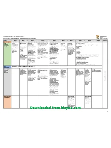
View all
1 . G11 LifeSciences DigitalSupport web Information Sheets
Grade 11 Life Sciences study guide, 7 pages. Read online or get the free PDF download.
Publisher: Study & Master
Life Sciences · Grade 11. Study guide, 7 pages. Read online or download the PDF.
- Subject
- Life Sciences
- Grade
- Grade 11
- Document type
- Study guide
- Publisher
- Study & Master
- Curriculum
- CAPS
- Pages
- 7
- File size
- 530.9 KB
Loading document…
Loading document…
1 of 7
Document textSearch extracted text and jump to a page.
Notes on specific study areas
Questions that involve Rules for drawings and diagrams
comprehension and extracting There are general rules that you need to follow when
doing drawings and constructing diagrams.
data from other material
These types of questions involve understanding or Drawings and diagrams must:
comprehending the information that is provided in
• be drawn in pencil (using a sharp HB pencil to
extracts from other textbooks, scientific journals
draw clear smooth lines)
and newspaper and magazine articles. The extracts
• be labelled in ink
that you are given in the question are relevant to
• be large enough (at least half of an A4 page) to
Life Sciences and its application to everyday life
see all the structures that are in the diagram
situations. The questions that are set on these extracts
• be positioned in the centre of the page
assess how well you can understand the information
• usually be two-dimensional (i.e. show length and
in the extract and how you interpret any data that the
width only)
extract contains.
• not be shaded
These are the important points to note when you are • have a title/caption below them.
answering a comprehension question:
• Read the extract thoroughly before you look at The following rules apply to the title/caption:
the questions. Ask yourself if you understand the • Remember that a biological specimen can be
information that is in the extract. sliced in different ways. This is the section of the
• If there are words that you do not understand, part, i.e. whether it is the transverse section (T/S),
look at how they are used in the extract and see if cross section (C/S), or longitudinal section (L/S).
you can work them out from the context. • The caption should show the source of the
• Now look at the questions. All the information diagram, i.e. whether it is from a specimen, a
that you need to answer the questions will be in micrograph or a slide.
the extract that you have been given. Remember • The magnification/scale of the drawing should be
this! placed either in the caption or in one corner of the
• Take each question in turn and go back through drawing itself.
the extract to find the answer. You can use the
wording in the extract to help you to put your
answer together. Remember that the answers to Label lines must:
the questions must be based on the information • be drawn in with a ruler (not hand-drawn)
that is in the extract that you have been given. • not cross each other
• Practise answering comprehension questions • not have arrows at the end
using the questions in this book. • touch the part/structure that is labelled
• If you have trouble constructing sentences in • be on one side of the diagram if there are few
English, use notes for each answer. As long as labels, otherwise both sides can be used
all the correct information is in your answer, you • be aligned neatly, preferably one label below the
will get the marks that you need. other.
Drawings and diagrams thin cell wall
Drawings and diagrams are essential in any science cytoplasm
and are particularly important in Life Sciences nucleus
because you use them to interpret what you see, e.g.
when you look at a specimen under the microscope large vacuole
or when you understand how the human body
works. But there are rules about scientific drawings intercellular
and diagrams. Remember that your drawing or air space
diagram is not a sketch. It is an easy-to-understand
representation of what you see.
Figure 1 A drawing of a typical parenchyma
As an example, look at the label lines in the drawing As an example, look at the features of Table 1 below:
in Figure 1. • It has a heading above it.
The following assessment criteria will be used by • It has two columns and eight rows.
teachers and examiners when they are assessing your • Each column has a heading.
diagrams: • The first column should indicate the independent
• shape variable (x-axis – position of the lamp).
• size • The next column (and other columns, if
• proportion (if the different parts of the diagram applicable) should indicate the dependent/
are the correct size in relation to the size of the responding variable (y-axis – diameter of the
object being shown) pupil).
• position of parts • Each piece of information is in a different cell.
• caption • The table has 2 × 8 = 16 cells.
• magnification/scale
Table 1 The changes in the diameter of the pupil of the eye in
• labels
response to light of different intensities
• neatness.
Position of the lamp Diameter of the pupil (mm)
Tables 1 1,2
A table is used to organise and present the data that 2 1,8
you have collected using as few words as possible. 3 2,4
A table is used as a summary of data. A table is
a rectangular grid that is divided into rows and 4 3,0
columns. Rows run from left to right across the table. 5 3,6
The shaded area in the table below illustrates a row 6 4,2
(made up of three cells).
7 4,8
The following checklist or rubric may be used by
your teachers and examiners to mark a table that you
have put together:
Columns are the vertical blocks of a table. The Assessment criteria 1 mark 0 marks
shaded area in the table below illustrates a column Heading
(made up of four cells).
Informative column headings
Informative row headings
First column: independent variable
Inclusion of units in headings
No units in body of table
Tables can be simple (made up of two columns and Neatness
a few rows) or complex (made up of many columns
and many rows). Full set of results recorded
Tables can be used:
Bar graphs
• to record the results of an investigation
Bar graphs are used to represent data where the
• to illustrate certain patterns/trends, e.g. the
independent variables, i.e. the variables on the
growth of a population
x-axis, are each associated with something different.
• to compare things, e.g. different organisms/organs
In other words, the bars on the graph compare
• to summarise information
different facts or information. The example that
• to provide the data that you will use to construct a
you have been given shows the different types of
line graph, a bar graph or a pie chart.
transport that different learners use to reach school.
There is no relationship between the different
A table should have a heading above it to state what types of transport, so a bar graph is the best way to
type of information it contains. Each column and represent the data.
each row may have its own heading, with units
where applicable.
When you construct a bar graph, remember: A histogram must have a title or caption. The
• The bars must be of the same width and must be independent variable (x-axis) and the dependent
the same distance apart from each other. variable (y-axis) should each be labelled.
• The bar graph can be presented vertically or The following table and the histogram drawn from
horizontally. the data in the table show how a histogram should be
• A bar graph must have a caption. drawn.
• The independent variable (x-axis) and the
dependent variable (y-axis) should each Example: The following table and histogram show
be labelled. Remember to use units if this is the range of learners’ marks in an assignment:
necessary.
Table 3 Number of learners with a particular %
The following table and the bar graph drawn from
the data in the table show how a bar graph should be Range (%) Number of learners
drawn. with a particular %
0–9 0
Example: The following table and bar graph 10–19 0
represent the type of transport that various learners 20–29 2
in a class use to get to school: 30–39 3
40–49 4
Table 2 Methods used by learners to get to school
50–59 7
Type of transport No. of learners using 60–69 10
this method 70–79 6
Walking 26 80–89 3
Bicycle 2 90–100 0
Taxi 1
Bus 3 12
10
30
Number of learners
8
25
Number of learners
6
20
15 4
10 2
5 0
0-9 10-19 20-29 30-39 40-49 50-59 60-69 70-79 80-89 90-100
0
Range of test marks (%)
walking bicycle taxi bus
Figure 3 A histogram showing the number of learners with a
Type of transport particular percentage test score
Figure 2 A bar graph showing the methods used by learners to
get to school The following rubric shows the criteria that your
teachers and examiners could use to mark bar graphs
Histograms and histograms:
A histogram is a type of bar graph. A histogram is Assessment criteria 1 mark 0 marks
used to represent data when the independent variable
(x-axis) represents groups of information along Correct type of graph
a continuous scale. Histograms are similar to bar Title/caption of graph
graphs, except that in histograms there are no spaces Correct choice and label for x-axis
between the bars because each bar is showing data Correct choice and label for y-axis
that are related to each other in some way, so the bars Appropriate units for x-axis
are continuous (next to each other).
Appropriate units for y-axis
The bars can be drawn horizontally or vertically.
Appropriate scale for x-axis
When drawing the bars, make sure that they are all
of the same width. Appropriate scale for y-axis
Bars drawn correctly
You will lose marks if: • The points are joined.
• you draw the wrong type of graph or you draw • A ruler may be used to join points that lie on
the bars incorrectly. Remember that a bar graph a straight line.
is used when the data are not related to each other • The points are not usually in an absolutely
and a histogram is used when the data are related. straight line because of experimental errors
• you draw the axes incorrectly. Remember that the and variation. In such cases a line of best fit
y-axis is always the vertical axis and the x-axis is is drawn. Those points that do not fit should
always the horizontal axis. be distributed fairly evenly on either side of
the line.
• If the points appear to be following a curved
Using line graphs pattern, then carefully draw a curve by
A line graph is used when the relationship between joining all the points. Do not draw short
two variables can be represented in a continuous interrupted lines.
way. An example of a continuous relationship • Only begin the graph at 0 when there are
between variables is the effect of temperature on the values for 0. If there are no values for 0, then
rate of photosynthesis. start the graph at the first plotted point.
A line graph has the following features: • Each graph must have a clear, descriptive title
showing the relationship between the variables,
• A horizontal axis called the x-axis for the
e.g. “The effect of temperature on the rate of
independent variable or manipulated variable.
photosynthesis”.
This represents the variable that is controlled or
• If more than one graph is drawn on the same set
changed during the investigation to determine
of axes, a key should be included or a dotted and
what effect it has. This axis must be appropriately
solid line should be used and labelled.
labelled with the units, e.g. Temperature (in
degrees Celsius).
• A vertical axis called the y-axis for the dependent Reading values off a line graph
variable or responding variable. This is the When reading information from a graph, use a dotted
response that is measured or monitored during line that extends from a point on the x-axis to the line
the investigation. In other words, it is the variable that you have drawn on the graph. Where this dotted
that reacts or which is measured or calculated. line intersects with the line on the graph, draw a
The axis must be appropriately labelled with broken line across to the y-axis and read the value at
units, e.g. Number of bubbles of gas produced per this point where the dotted line touches the y-axis.
minute.
• An appropriate scale to represent data. The Example: Using the graph below, determine how
points plotted should use most of the axis, i.e. long it took for the plant to release 30 bubbles.
the available space. In order to do this, you must
study the range of readings and then work out the
Number of bubbles released
50
lowest and the highest values for each scale. The
scale you choose should always be in a regular 40
sequence, i.e. all scale divisions must be equal, 30
e.g. 4 in 4, 8, 12, etc. Each axis must be labelled
with the appropriate units and what is shown 20
on each axis. Using the example of the effect of 10
temperature on the rate of photosynthesis: the
temperature would be on the x-axis – labelled 0
Temperature (°C) – and the number of bubbles of 0 5 10 15 20 25
gas produced per minute would be on the y-axis Time (minutes)
– labelled Rate of photosynthesis (number of
bubbles of gas produced per minute). Figure 4 Line graph showing the relationship between number
of bubbles released by a plant and time
• Plotting the points. The data given in a table are
then plotted on the graph. You use the X and Y
coordinates to plot the points. Your reading shows that it took 15 minutes for the
• plant to release 30 bubbles of gas.
Your teachers and examiners may use the following Constructing the pie chart:
criteria to assess how you have drawn a line graph: 1. A compass may be used to draw the circle and
Assessment criteria 1 mark 0 marks a protractor may be used to construct accurate
Correct type of graph angles for each sector or slice.
Title of graph 2. Begin with the largest angle/percentage starting
Correct choice and label for x-axis at 12 o’clock. In the example above: insects
Correct choice and label for y-axis 295,2° or 82%, then the next largest, and so on.
Correct units for x-axis 3. Shade and label each slice and/or provide a
Correct units for y-axis suitable key. For example:
Appropriate scale for x-axis
(constant intervals)
insects
Appropriate scale for y-axis
(constant intervals)
reptiles
Points plotted correctly
All plotted points joined correctly arachnids
birds
Pie charts
A pie chart shows data as a percentage or as a
relative proportion of the total of a circle. You
draw a pie chart by dividing a circle into sectors/ Figure 5 Pie chart showing the percentage of each animal type
slices (think of a pizza) to represent each item as a present in the ecosystem
percentage of the whole. A complete circle represents
the whole or 100%, a half-circle represents 50%, and Your teachers and examiners may use the following
so on. criteria to assess your pie chart:
First calculate the percentages that you will use for
each slice. You can then calculate the angle of each Assessment criteria 1 mark 0 marks
of the slices using the following formula (remember Correct type of graph
that there are 360° in a circle): Suitable title/caption
Appropriate labels/key
a = v × 360
Calculating % of each sector/slice
t
Calculating degrees of each sector/
where:
slice
a = the angle of the slice/vector
Sectors/slices drawn correctly
v = the amount of the variable
t = the total (100 in the case of percentage).
Mathematical skills in
Example: In an ecosystem, 41 insects (ants,
butterflies, and so on), two reptiles (lizards), three Life Sciences
arachnids (spiders) and four birds were counted.
This gives a total of 50 animals. Use a pie chart Mathematical skills are an important part of Life
to represent the percentage of each type of animal Sciences.
present in the ecosystem.
The percentage and degrees (using the formula) have Scales
been worked out and recorded in the table below:
Scales are used to determine the actual size of an
Animals % Sector/slice object that is reduced in size in a diagram, e.g.
calculating the width of the stomach in Figure 6.
Insects ______ 41 50
x 100
= 82% 82 100
x 360
_____ = 295,2° You are expected to measure the width of the
Reptiles 2 x
_____ 100
= 4% 4 100
_____x 360
= 14,4° stomach and then multiply this by the scale given in
50
3 x 100 6 x 360
the diagram. For example, if the width of A in Figure
Arachnids _____ 50
= 6% _____
100
= 21,6° 6 is 13 mm, then the actual width is 13 × 5 which is
Birds 4 x
_____ 100
= 8% 8 100
_____x 360
= 28,8° equal to 65 mm (because the scale is 1:5).
50
Example 2: Mark-recapture experiments:
N = C × M
R
where:
A N = estimated population size
C = total number of individuals captured
M = total number of marked individuals
R = total number of marked individuals
recaptured
Stock questions on
investigations
Figure 6 Part of the 1. Suggest a hypothesis.
human digestive system.
Scale of drawing: 1:5 2. What is the aim of the investigation?
Scales are also used to determine the actual size of 3. Identify the:
a drawing/diagram of some organism/organelle that • independent variable/s
is microscopic, e.g. calculating the actual length of a • dependent variable/s
microscopic bacterial cell. You need to measure the • fixed variable.
length using a ruler and then divide this figure by the 4. Name the variable/factor that is controlled by
magnification indicated or in the drawing. the investigator.
5. Describe the results of the investigation.
Averages 6. Predict the results of the investigation.
To find the average, you find the sum of all the items 7. How can the design of the investigation be
and divide this total by the number of items. changed to obtain more reliable results?
8. Describe a control for the investigation.
Example: In a class of 10 learners, the following
marks were obtained in a test: 9. State a conclusion from the results of the
85, 54, 67, 90, 95, 80, 60, 50, 35, 40. investigation.
Total = 656 (Add all ten figures) 10. Is the conclusion a valid one? Explain.
Average = 656 11. Do the results support the hypothesis?
10 12. Plot a line graph of the results.
= 65,6
Formulae
A formula is used in certain types of calculation. In
Mathematics you learnt to substitute numbers into a
formula. Exactly the same procedure is used when
using formulae in other subjects.
Example 1: Simple sampling:
Estimated total number of individuals in a population
= number of individuals in sample area × habitat size
sample size
Study this subject
Notes, quizzes and topic questions for Grade 11 Life Sciences.
- Grade 11 Life Sciences notes
CAPS revision notes with worked examples.
- Life Sciences questions by topic
Past exam questions sorted by CAPS topic, with memos where available.
- Grade 11 Life Sciences quizzes
Short topic quizzes with instant feedback.
- All Grade 11 Life Sciences past papers
Past papers by year, with memos where available.
- Grade 11 Study guides
More Life Sciences and other subjects in this collection.
Recommended for this subject
More papers and memos for this grade and subject.
Annual teaching plan
Gr 11 Life Sci ATP 2023 24
Memorandum
Life Sciences Grade 11 Eastern Cape November 2025 Memo (Afr)
Memorandum
Life Sciences Grade 11 P1 Eastern Cape November 2025 Memo (Eng)
Question paper
Life Sciences Grade 11 Eastern Cape November 2025 QP (Afr)
Question paper
Life Sciences Grade 11 P2 Eastern Cape November 2025 QP
Question paper and memo
Life Sciences Grade 11 KZN June 2025 Paper & Memo
Related documents
Question paper and memo
Life Sciences Grade 11 Eastern Cape June 2024 Paper & Memo
Memorandum
Life Sciences Grade 11 P2 Eastern Cape November 2024 Memo (Afr)
Memorandum
Life Sciences Grade 11 P2 Eastern Cape November 2024 Memo (Eng)
Question paper
Life Sciences Grade 11 P2 Eastern Cape November 2024 QP (Eng)
Question paper and memo
Life Sciences Grade 11 KZN June 2024 Paper & Memo
Question paper
Life Sciences Grade 11 NW June 2024 Question Paper (Afrikaans)
More from Grade 11 Life Sciences
Question paper
Life Sciences Grade 11 NW June 2024 Question Paper (English)
Memorandum
Life Sciences Grade 11 P1 Eastern Cape November 2023 Memo (Afr)
Memorandum
Life Sciences Grade 11 P1 Eastern Cape November 2023 Memo (Eng)
Memorandum
Life Sciences Grade 11 P2 Eastern Cape November 2023 Memo (Afr)
Question paper
Life Sciences Grade 11 P1 Eastern Cape November 2023 QP (Eng)
Question paper